A Simpler Chart, Upon Request
Author:
Vanessa Otero
Date:
09/12/2024
“This chart is too crowded.”
“The logos are too small.”
“I’ve never heard of some of these.”
“What about Reuters?”
“Where’s BBC?”
“How about Al Jazeera?”
These are all comments we get regularly from our fans on social media and by email. The paradox of our information age is that people want all the information but also want it to be easy to digest. It’s impossible to create a Media Bias Chart® that has everything people want, but we do our best!
For years, people have asked us to rate more and more news sources, and we have. But with over 4,000 news and information sources completed, we’ve long passed the day where we could include them all in one chart. So we’ve done a few things:
- Created an Interactive Media Bias Chart® and a free app for Android and iPhone that allows you to search them all;
- Produced monthly editions with just websites, just TV shows/videos, and just podcasts;
- Produced two flagship versions of the chart per year with a rotating mix of as many news sources of all types as we can fit.
Our latest, frequent request is this: Can you make a simpler, easier-to-read version? Maybe one with just some major sources?
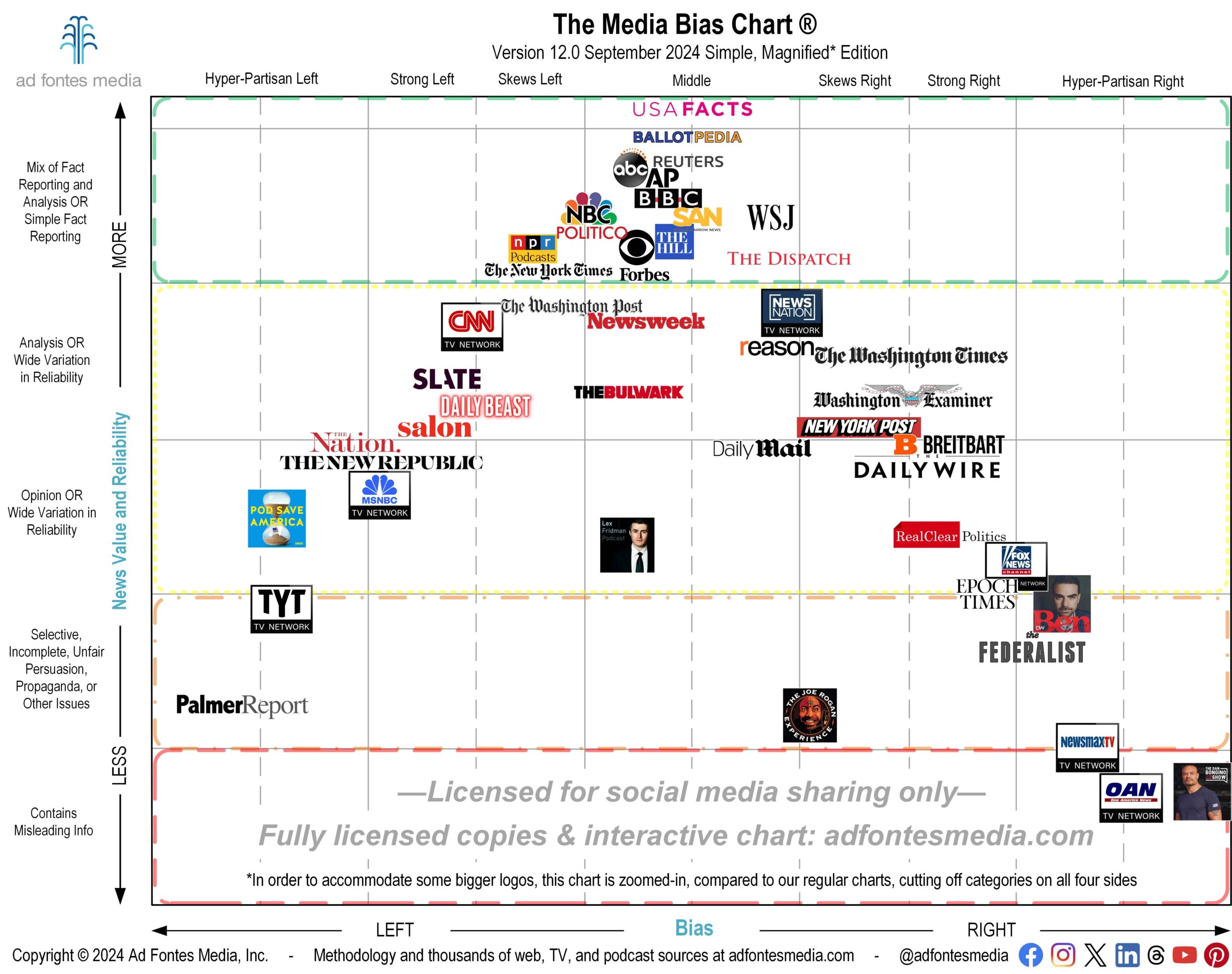
We aim to please, so here you go! You can download a free, licensed version of this Simple, Magnified Media Bias Chart® here!
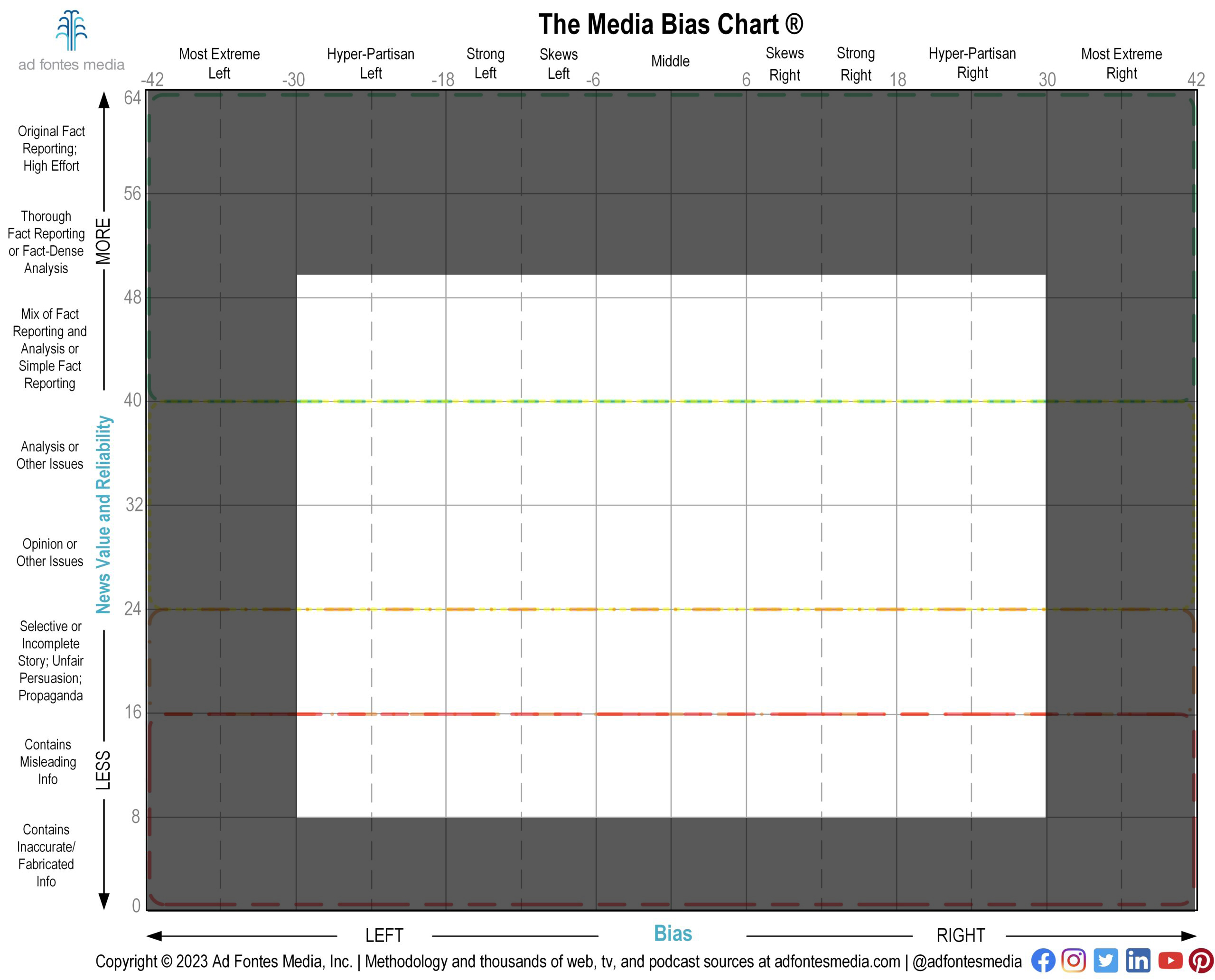
First, it’s important to understand that the image above does not encompass the full Media Bias Chart®. In order to make the logos as large and readable as possible, we have magnified a portion of the chart and removed the sections around the edges, as you can see below.
That means that we have omitted sources that fall entirely within the “Most Extreme” right and left bias categories and the “Contains Inaccurate/Fabricated Info” reliability category (like Alex Jones’ show, for example).
This chart features only 47 sources from web, podcasts and TV/video (find a list here). Why these 47?
It’s close to the election, so we included a couple of sources — USAFacts and BallotPedia — at the very top that aren’t so much “news” sources in the journalism/reporting sense, but they are information sources full of reliable facts pertaining to the news and the election.
The top middle of the chart is (thankfully) a crowded part of the news landscape, so we could only fit some of the very largest news sources there. It is especially crowded in the area just to the left of the “middle” line. You’ll find the biggest wire services, AP and Reuters, which have thousands of reporters each; the largest national newspapers (NYT, WaPo, WSJ); and the major broadcast TV networks (ABC, CBS, NBC).
And we included ones that aren’t necessarily the largest, but are big enough, and sit in areas where there aren’t a ton of others that are bigger (Straight Arrow News, The Dispatch, The Bulwark, Palmer Report).
For this simplified version, we included the overall scores for cable TV news networks (Fox News, MSNBC, CNN, NewsNation, Newsmax, TYT and OAN) rather than individual shows from those networks. The rest of the chart is filled with websites and podcasts that have large audiences.
On the podcasts, you might understand why we picked podcasts that pretty much always talk about political news and opinion, such as Pod Save America, Ben Shapiro, and Dan Bongino, but wonder why we included Joe Rogan and Lex Fridman, which are primarily interview podcasts of non-political and political guests. We’ve observed that both of these podcasts, especially during election season, have very high-profile political and news-related guests. Lex Fridman recently interviewed former President Trump. The reliability and bias ratings of these podcasts are made up of both what the guests say and how the host interacts with the guest. For more on Joe Rogan’s podcast rating specifically, check out our video about it.
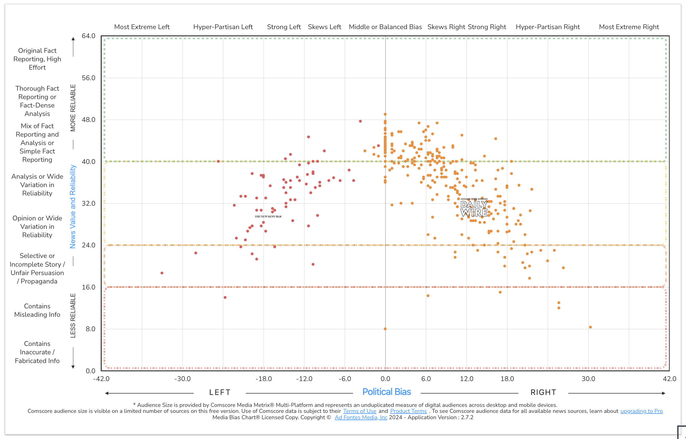
One kind of complaint we often get is specifically about news sources halfway up the chart on the left and right, in the “Analysis or Wide Variation in Reliability” and “Opinion or Wide Range in Reliability” categories. People see sources on the left and right at similar heights and say, “The New Republic is not equivalent to the Daily Wire!” And they are right — the sources are not equivalent in the makeup of their articles.
The New Republic is mostly opinion and analysis, with a tighter distribution of articles in those sections. The Daily Wire publishes more misleading and unfair articles, but also more fact-reporting articles, so it is better characterized as “Wide Variation in Reliability.” You can only see that if you dive into the scatterplot on the Interactive Media Bias Chart®. (Each dot you see on the image above represents an article from that website that our analysts rated; you can click on those dots to see the article analyzed by our team).
So is it “correct” or “fair” that the sources are at the same “level” of reliability on the chart? Maybe, and maybe not. After all, how reliable (for fact-based news) is an outlet that’s mostly opinion and analysis? More or less than an outlet that has a lot of true fact reporting but too many misleading articles?
In any case, these websites are less reliable for news, overall, than an outlet with lots of fact reporting, less opinion, and rarely misleading articles. But this is the best way we have found to represent source-level vs. article-level data so far, and we are open to your ideas on how we could do it better.
You also might be wondering why there are logos in the bottom right of the chart but not on the bottom left. That’s because we’ve rated no sources with large audiences that fall into the “Contains Misleading Info” category of reliability with a bias to the left. There are certainly sources that fall within that section of the chart, and you’ve seen them when we publish our monthly charts that focus on particular formats (podcasts, TV shows/videos, etc.). But they are less well known with small audiences, and therefore didn’t meet the parameters to be included on this special chart.
If you’re one of the many people who have asked us for a more simple chart containing only the most popular news sources, we hope this meets your needs. Stand by for the return of our standard monthly charts organized by format, with the release of the September podcast chart next week!
In the meantime, you can keep up on all of our work with our biweekly email newsletter. Sign up here if you haven’t already!
Vanessa Otero is a former patent attorney in the Denver, Colorado, area with a B.A. in English from UCLA and a J.D. from the University of Denver. She is the original creator of the Media Bias Chart (October 2016), and founded Ad Fontes Media in February of 2018 to fulfill the need revealed by the popularity of the chart — the need for a map to help people navigate the complex media landscape, and for comprehensive content analysis of media sources themselves. Vanessa regularly speaks on the topic of media bias and polarization to a variety of audiences.


