
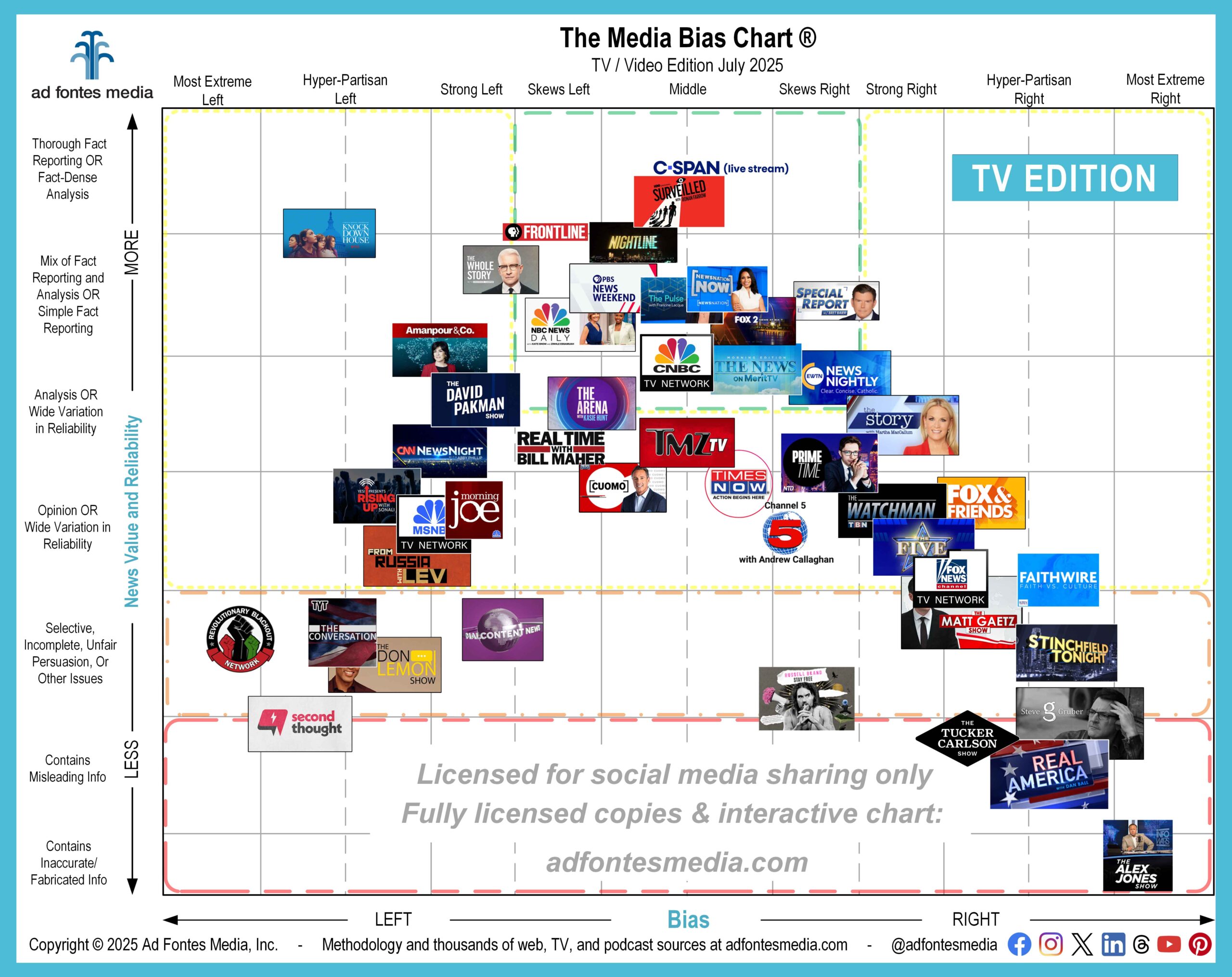
Many people have noted that the Media Bias Chart® typically displays logos in a “bell” shape. That’s because high-reliability sources (those are ones near the top of the chart) often are also low-bias sources (which means they are placed near the left-right center). Low-reliability sources (ones near the bottom) often are also highly biased (which places them on the left or right of the chart and away from the center).
But there are exceptions. For example, on the July Media Bias Chart® for TV/video we’re releasing today, you’ll see the logo for “Knock Down the House” in the upper-left corner. If you see our charts regularly, you know that few sources fall in the top left or top right of the chart.
“Knock Down the House” is a Netflix documentary that focuses on the 2019 primary campaigns of four progressive Democrats: Alexandria Ocasio-Cortez, Amy Vilela, Cori Bush and Paula Jean Swearengin. The film is making its debut on the Media Bias Chart® this month.
Our analyst team found the documentary to be highly reliable and fact-based, giving it an overall reliability score in the category of “thorough fact reporting or fact-dense analysis.” However, analysts also detected a hyper-partisan left bias in the film, mainly because of two factors: 1) topic selection and 2) platforming of political positions of the candidates, which are to the left of median-left U.S. elected officials. Documentaries are one of the more common types of news-like informational content that ends up in such a unique place on the chart.
So yes, some information in the vast media landscape is factual but also highly biased. It’s not common, but it does happen, and it’s an illustration of the concept that some aspects of political bias — for example, highlighting or positively promoting certain policy positions — in and of itself isn’t necessarily a bad thing. We just measure the level of that bias so people are aware of the one-sided nature of such content.
In addition to the Netflix documentary and ones from HBO (“Surveilled”) and MSNBC (“From Russia With Lev”), the July TV/video chart features logos representing entire networks (MSNBC, CNBC and Fox), as well as individual shows from network and cable TV, YouTube and other video platforms. The 47 sources on the July chart are a small sample of the more than 780 TV/video sources that our team has fully rated.
It’s impossible to show hundreds of logos in one image — they overlap each other, and the result is a completely unreadable chart — so we choose a sample to feature each month. In order to make the logos as large and readable as possible, we have magnified a portion of the chart and removed portions around the edges that contain no sources.
Fourteen shows appear in the green box of the July chart. Remember: Sources recommended by our team to be minimally biased and to provide fact-based information fall within the green box. (More TV/video sources fall within the green box, and we’ll feature those on charts in the future.)
- ABC: Nightline
- Bloomberg: The Pulse with Francine Lacqua
- C-SPAN Live Stream
- CNBC TV Network
- CNN: The Arena with Kasie Hunt
- EWTN: EWTN News Nightly
- FOX 2 St. Louis KTVI: FOX 2 News at 6PM
- Fox News: Special Report w/ Bret Baier
- HBO: Surveilled
- Merit Street Media: The News on Merit TV: Morning Edition
- NBC News NOW: NBC News Daily With Kate Snow and Zinhle Essamuah
- NewsNation: NewsNation Now With Nichole Berlie
- PBS News Weekend
- PBS: Frontline
In addition to “Knock Down the House,” five sources appear on the Media Bias Chart® this month for the first time:
- NTD: Primetime
- OAN: Real America with Dan Ball
- PBS News Weekend (this one is also in the green “recommended” box!)
- Second Thought (YouTube)
- TMZ on TV
Don’t see your favorite show on the July chart? You can look up ratings on all sources we’ve analyzed and create custom chart images using our free mobile app available for Apple and Android. You also can access the free version of the interactive chart on the website, which allows access to data on 250 of our top sources. Daily search limits apply.
For expanded access, please consider a News Nerd subscription, which gives you the ability to search all sources we’ve rated and provides many additional benefits.
When you add in our web/print and podcast/audio ratings, our analysts have fully rated more than 4,280 sources, with commercial data on about 12,950 sources. Keep up on all of our work by joining our email list!
 Beth Heldebrandt is Director of Communications at Ad Fontes Media. She has more than 30 years of experience in the fields of journalism and public relations, and was an adjunct instructor of journalism for 17 years at Eastern Illinois University. Beth has a B.A. in journalism from Southern Illinois University-Carbondale and an M.A. in English from Eastern Illinois University. She’s a mom and grandma, and enjoys traveling, puzzles and reading.
