
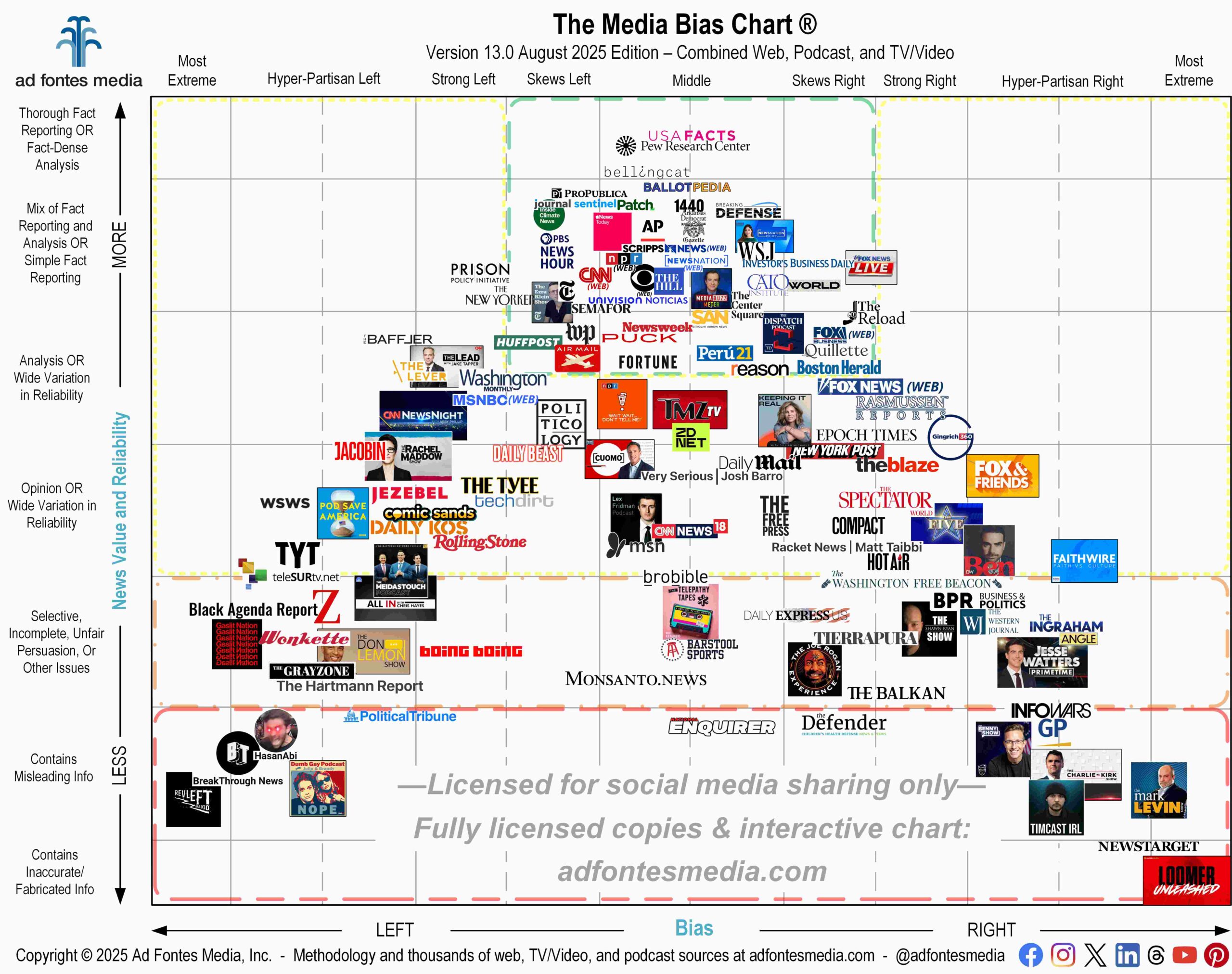
Ad Fontes Media’s new flagship Media Bias Chart® is a guide to help you choose healthy sources of information and to break out of your filter bubble. We live in a polarizing political and news environment, and it’s important to keep your news diet healthy while also consuming news from a variety of sources and viewpoints.
The flagship Media Bias Chart® is a static JPG or PDF infographic that includes sources from various types of media all in one image, and it’s released only twice per year, in January and August. During the rest of the year, we produce monthly charts that are specific to web/print, podcast/audio and TV/video.
With each chart release, the questions we get most often are about which sources are the “best” — the least biased and most reliable to give you verifiable facts. In order to help you determine that at a glance, the Media Bias Chart® is divided into different colored sections.
Sources in the green section of the chart are the fruits, vegetables, and lean protein — the ones we’ve found to provide fact-based, reliable and minimally biased or balanced information for a healthy news diet.
Sources in the orange and red sections are the candy or junk food — the ones we’ve found to contain unfair, false, or misleading information and/or extreme bias. They can be very satisfying to consume but are generally unhealthy, especially if you’re having candy for breakfast, lunch and dinner.
Sources in the yellow section are like bread and pasta — they can be heavy with analysis and opinion, and they will fill you up with information, but one cannot live on bread alone. We suggest caution and additional inspection of sources in the yellow section, for various reasons.
The content may vary widely in reliability (for example, some episodes of a podcast may be highly reliable and other episodes less so). Or the source may have high levels of bias even though their content is generally reliable. So remember, use caution when consuming information from sources in the yellow section of the Media Bias Chart®.
To maintain a healthy news diet, we encourage you to try out the sources in the green box, even if you haven’t consumed them before. Relying on these sources for information regularly will make you a healthy and informed media consumer.
Some of them have a bias to your opposite political side, because the green box includes sources with a “skews left” or “skews right” bias. Being exposed to reliable, but minimally biased content from the “other side” can help keep you from getting stuck in a filter bubble. And it can help you to have meaningful conversations with friends and family who may not agree with you politically.
This flagship chart contains a total of 132 sources: 92 from web/print, 20 podcast/audio and 20 TV/video programs. It includes a mix of national, international and local sources. We know it can be difficult to see the individual logos, so a list of all sources on the flagship chart is available here.
Keep in mind that these are only a sample of the thousands of sources our team has fully rated (2,690+ websites, 800+ podcasts, and 800+ TV/video programs!). We’ll be back with monthly charts for web, podcast and TV/video sources in September.
Click here to access your FREE download of the flagship chart to print or to use in a class or presentation. You can also order a large, 18-inch by 24-inch poster of the new flagship chart on our website.
Altogether our team has fully rated 4,300 media and information sources, with commercial data on more than 13,000! If you don’t see your favorite source on this flagship chart, you can search for it on the Interactive Media Bias Chart. It’s free, but you can access only 250 sources, and there are limits in how many searches you can conduct per day.
To get expanded access, you’ll need a News Newbie or News Nerd subscription. Our subscribers can search all 4,300 sources our team has fully rated, with other added benefits!
You can also search all sources on our app available for iPhone and Android. Download the app from the App Store and Google Play. Daily search limits apply.
Want to stay informed on all of our amazing work? Join our free email list!
 Beth Heldebrandt is Director of Communications at Ad Fontes Media. She has more than 30 years of experience in the fields of journalism and public relations, and was an adjunct instructor of journalism for 17 years at Eastern Illinois University. Beth has a B.A. in journalism from Southern Illinois University-Carbondale and an M.A. in English from Eastern Illinois University. She’s a mom and grandma, and enjoys traveling, puzzles and reading.
