New Flagship Media Bias Chart Features 137 Web, Podcast and TV/Video Sources
Author:
Beth Heldebrandt
Date:
01/26/2026
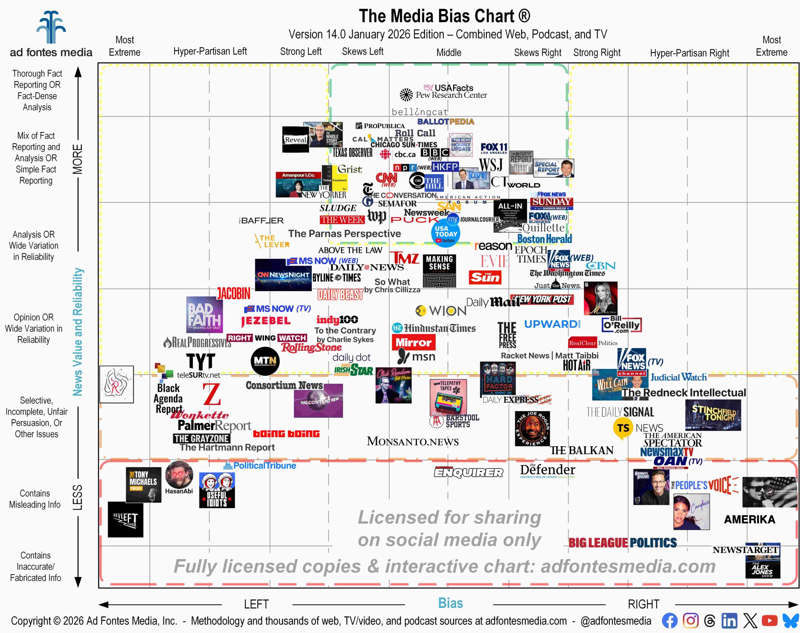
Ad Fontes Media has released its new flagship Media Bias Chart®, which includes many sources for various types of media all in one image, but not every media source that exists. It’s a great (yet necessarily incomplete) visual guide to understanding our complicated media landscape.
This flagship chart contains a total of 137 sources: 100 from web/print, 19 podcast/audio and 18 TV/video programs. It includes a mix of national, international and local sources. We know it can be difficult to see the individual logos, so a list of all sources on the flagship chart is available here.
We release the flagship chart only twice per year, in January and August. During the rest of the year, we publish monthly charts that are specific to web/print, podcast/audio and TV/video.
The flagship chart is a handy media literacy resource, but it can’t cover everything! Because it is a two-dimensional image, we’re limited on the number of sources we can include. We fit 137 source logos on this chart, although our analyst team has fully rated more than 4,500 news and news-like sources (2,840+ websites, 870+ podcasts, and 850+ TV/video programs).
For example, BBC is included on this chart (near the top middle), but you might wonder where are other large outlets like Associated Press (AP) or Reuters? All three fall in the same general area of the chart (meaning we rate them all highly reliable and minimally biased), and we only included BBC this time because having a bunch of logos that overlap makes for an unreadable chart. You can still find AP and Reuters in those spots on our Interactive Media Bias Chart® and on the mobile apps. One of our top social media comments every time we release a version is “Where’s BBC???” (sometimes we even get that when BBC is on there). This time, we look forward to all the “Where’s AP???” and “Where’s Reuters???” comments instead.
Some have asked whether CBS News has moved (to the right) since the network was purchased by Paramount Skydance last summer and particularly since they acquired The Free Press and named its founder, Bari Weiss, the editor-in-chief of CBS News. We’ve found that the degree to which leadership changes affect a news source’s content output varies based on how intentionally leadership tries to change it — sometimes it’s a lot and sometimes it is not much. We’re sampling new content from CBS properties including CBS News’ website, “60 Minutes” and “CBS Evening News,” and we’ll be sure to note any significant changes to the network’s overall bias and reliability. Our sample so far still has the CBS News website near the top middle.
What about ABC News and NBC News? They aren’t included on this chart, because the NBC website falls right where the NPR logo is and ABC falls close to where the BBC logo is. Again, you can still find ABC and NBC News on our interactive chart, and they will be rotated back in on future versions.
As we’ve explained in a previous blog post, we’ve made a concerted effort over the past several months to rate news-focused Substacks, and you’ll find many on this chart: The Parnas Perspective (new to the chart), To the Contrary by Charlie Sykes, Big League Politics, Racket News | Matt Taibbi, The Hartmann Report, The Redneck Intellectual – C. Bradley Thompson, and So What by Chris Cillizza.
Another website to note on this chart is The Epoch Times. You may recall that we began conducting an audit of this website in 2025. Over the past few years, The Epoch Times has had significant changes in their leadership, editorial staff and approach, which is why we agreed to audit their content at their request. Since we first rated it in 2019, the website’s reliability score has risen more than 10 points and its bias score has improved by 8 points. One of the biggest factors in this improved score is that they removed dozens of older low-reliability articles and replaced them with brief editors’ notes stating why (articles were removed both before and during our audit). Correction or removal of low-reliability articles improves overall news source scores, but the instance of the original error still factors in, as well. You’ll now find The Epoch Times just below the green box and in the “skews right” category of bias on the Media Bias Chart®. We are nearly complete with our audit and will publish another full blog post on the results.
For TV, you’ll notice that we’ve included some networks on this chart, specifically MS NOW (formerly MSNBC), OAN, Newsmax and Fox News. The TV network scores are an average of all the individual shows we’ve rated from those networks. We’ve also included some individual news shows, like CNN’s “The Whole Story with Anderson Cooper” and Fox News’ “The Will Cain Show,” which is on the chart for the first time. You’ll also find logos for the MS NOW and Fox News websites, which are more reliable and less biased than their respective TV networks are.
The flagship chart also includes several podcasts, such as The Joe Rogan Experience, The Benny Show, The Megyn Kelly Show, and a new one to the chart, America First with Nicholas J. Fuentes. In addition, we’ve included a few YouTube channels: HasanAbi, Malcontent News, and two new ones, the channels for USA Today and MeidasTouch.
If you’d like a copy of the flagship chart for your own reference or to use in a class or presentation, you can download it for free here. You can also order a large, 18-inch by 24-inch poster of the new flagship chart on our website.
Remember, if you’re curious about a source but don’t see it on this flagship chart, you can search for it on the Interactive Media Bias Chart®. It’s free, but you can access only 250 sources, and there are limits in how many searches you can conduct per day.
To get expanded access, you’ll need a News Newbie or News Nerd subscription. Our subscribers can search all 4,500 sources our team has fully rated, with other added benefits!
You can also search all sources on our app available for iPhone and Android. Download the app from the App Store and Google Play. Daily search limits apply.
Want to stay informed on all of our amazing work? Join our free email list!


