
According to a study by Pew Research Center, young adults follow the news less closely than any other age group. In fact, the likelihood of seeking out news is proportional to age, with older Americans following the headlines the most closely.
When it comes to accessing news on social media, however, those trend lines are flipped. Seventy-six percent of Americans ages 18-29 say they get their news from social media at least sometimes, while only 28% of those age 65 and older do.
It’s no surprise, then, that Pew found that young adults are more likely to get news incidentally – that is, without looking for it. When it comes to political news, 70% of young adults say they get it because they happen to come across it (from social media, especially Instagram and TikTok), compared with 30% who seek it out. Those 65 and older, however, are more likely to get news because they’re looking for it.
Because younger Americans get their news incidentally from social media, they’re often getting information pushed to them by digital algorithms and filtered by their favorite news influencers. According to the Pew study, if they already have a “background” with the news influencer and already “agree with that person,” then they’re more likely to trust them to provide information.
This trend is concerning because it means that younger adults are more likely to live in information bubbles, receiving information that already agree with their world view and provided by people who are often not trained journalists intent on providing fact-based and minimally biased information (read our analysis about news influencers here). According to the study, U.S. adults under age 30 say they are more likely than any other age group to trust the news they get on social media and less likely to trust information from local and national news organizations.
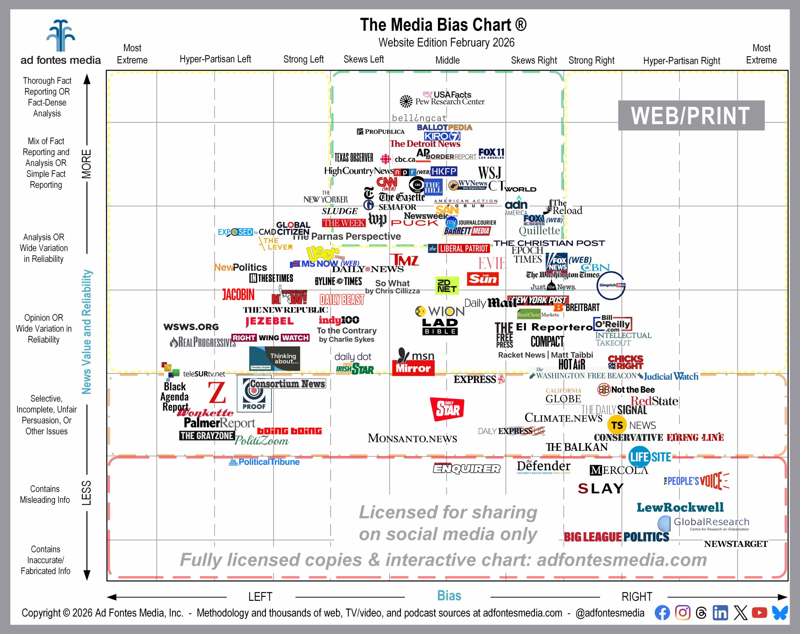
Here at Ad Fontes Media, we encourage news consumers of all age groups to break out of their information bubbles as much as possible. That means intentionally seeking out news sources rather than relying on internet algorithms to feed you information. We also recommend that you take a look at sources from the top to the bottom and from the left to the right portions of the Media Bias Chart® so you can see how different news sources are reporting on the same story (our weekly Topic of the Week exercises are an excellent way to get an overview of the varying media landscape).
Start a habit of shattering your information bubble with the February edition of the Media Bias Chart® for Web/Print that we’re releasing today. This chart features 127 of the 2,850 web/print sources our team has rated so far. You’ll notice that this chart contains a variety of sources of online information: local websites, national news organizations, Substacks, newsletters and wire services. We know it’s hard to read all of the source logos on the chart, so we’ve provided a list of the 127 sources here. (We’ll be back with charts that focus on podcasts and TV/video sources later this month).
To vary your media diet, we recommend choosing sources you haven’t read before from the top middle of the chart, from the left side, and from the right side. Sources in the green box (top middle) of the chart have been rated by our team to be minimally biased and to provide fact-based information. You will notice a difference in how the news is reported by comparing green-box sources with opinion sources on the left and right and with any sources that fall in the bottom portion of the chart.
Here’s a list of the sources from the February chart that fall within the green box (many more web/print sources fall within the green box, and they will be included in future releases of the Media Bias Chart®):
- ADN America
- American Action Forum
- AP | Associated Press
- Ballotpedia
- Barrett Media
- Bellingcat
- BorderReport
- CBC Canada
- CBS News (website)
- CBS Seattle KIRO 7
- Christianity Today
- CNN (website)
- FOX 11 LA KTTV
- Fox Business (website)
- High Country News
- Hong Kong Free Press HKFP
- Jacksonville Journal-Courier
- Newsweek
- NPR (website)
- Pew Research Center
- ProPublica
- Puck News
- Quillette
- Semafor
- Sludge
- Straight Arrow News
- Texas Observer
- The Christian Post
- The Detroit News
- The Gazette
- The Guardian
- The Hill
- The New York Times
- The Parnas Perspective
- The Reload
- The Week
- USAFacts
- Wall Street Journal
- Washington Post
- World News Group
- WV News
Ten sources make their debut on this month’s chart:
- ADN America
- CBS Seattle KIRO 7
- Daily Star
- El Reportero SF
- Global Citizen
- High Country News
- Lifesite News
- Proof by Seth Abramson
- The Liberal Patriot
- WV News
Remember, we choose a selection of sources to include on each month’s chart because it’s impossible to put all of them in a single image. Can you imagine a chart with 2,850 sources on it? The logos would overlap, and the result would be an image that is impossible to read. In order to make the logos as large and readable as possible, we have magnified a portion of the chart and removed portions around the edges that contain no sources.
If you don’t see your favorite source on the February chart, that doesn’t mean we haven’t rated it! You can search for it on the Interactive Media Bias Chart® on the website. It’s free, but you can access only 250 sources, and there are limits in how many searches you can conduct per day.
To get expanded access, you’ll need a News Newbie or News Nerd subscription. Our subscribers can search all sources our team has fully rated (websites, podcasts and TV/video), with other added benefits!
You can also search all sources we’ve rated on our free mobile app for Android or Apple. Daily search limits apply.
Want to stay informed on all of our amazing work? Join our email list!
 Beth Heldebrandt is Director of Communications at Ad Fontes Media. She has more than 30 years of experience in the fields of journalism and public relations, and was an adjunct instructor of journalism for 17 years at Eastern Illinois University. Beth has a B.A. in journalism from Southern Illinois University-Carbondale and an M.A. in English from Eastern Illinois University. She’s a mom and grandma, and enjoys traveling, puzzles and reading.
