
According to research by the Medill School of Journalism at Northwestern University, almost 40% of all local U.S. newspapers have vanished over the past 20 years. As a result, the number of news deserts – areas that lack consistent local reporting – has grown steadily, with Medill estimating that 212 U.S. counties have no local news source and another 1,525 counties have only one news source remaining, typically a weekly newspaper. Taken together, according to Medill’s 2025 The State of Local News report, about 50 million Americans live with limited or no access to local news.
This is alarming to us here at Ad Fontes Media because our analysis has shown that local news websites are more reliable and less biased overall compared to all other news sources we rate (national and international reporting, podcasts, videos and TV). So while people have more and more ways to get news information these days, the most reliable sources of news are disappearing.
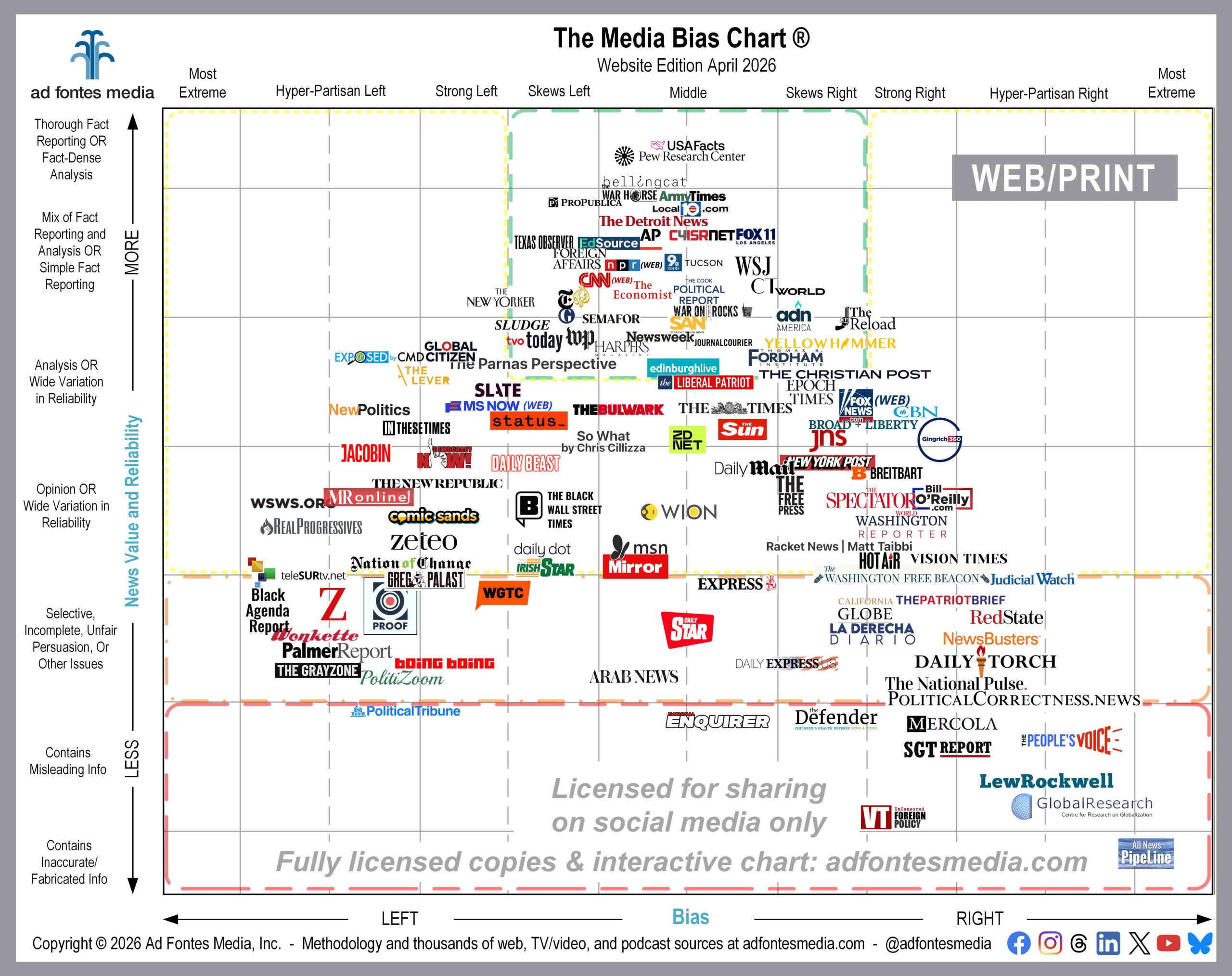
We include local news sources on the Media Bias Chart® because they are a valuable resource of information for people in various communities, and these local sources report on news that citizens can’t get anywhere else. It may seem odd to see The Detroit News and a local TV station in Tucson on the chart alongside Associated Press (AP) and The Economist, but to us, all are equally important when it comes to providing valuable information.
The April edition of the Media Bias Chart® for Web/Print that we’re releasing today includes nine websites of local newspapers or TV stations. All but one fall inside the green box. Sources in the green box (top middle) of the chart have been rated by our team to be minimally biased and to provide fact-based information.
This is typical. Overall our analysis team has rated 2,900 websites, and 1,402 (48%) are local. Of those 1,402 local websites, 1,329 of them fall within the green box. That’s 95%! That’s an impressive endorsement of the quality of local reporting, and it’s tragic that so much of it is now being lost.
Here’s a list of all sources from the April Media Bias Chart® for Web/Print that fall within the green box. Local news websites are in bold:
- ABC Miami Local 10 WPLG
- ADN America
- Al Jazeera (website)
- AP | Associated Press
- Army Times
- Bellingcat
- C4ISRNET
- Christianity Today
- CNN (website)
- Edinburgh Live
- EdSource
- Foreign Affairs
- FOX 11 LA KTTV
- Harper’s Magazine
- Jacksonville Journal-Courier
- KGUN 9 Tucson
- Newsweek
- NPR (website)
- Pew Research Center
- ProPublica
- Semafor
- Sludge
- Straight Arrow News
- Texas Observer
- The Christian Post
- The Cook Political Report with Amy Walter
- The Detroit News
- The Economist
- The Guardian
- The New York Times
- The Parnas Perspective
- The Reload
- The Thomas B. Fordham Institute
- The War Horse
- TVO Today
- USAFacts
- Wall Street Journal
- War on the Rocks
- Washington Post
- World News Group
- Yellowhammer News
The April edition of the web-print chart features 122 of the 2,900 web/print sources our team has rated so far. We know it’s hard to read all of the source logos on the chart, so we’ve provided a list of the 122 sources here. (Stay tuned for charts that focus on podcasts and TV/video sources later this month).
Ten sources make their debut on this month’s chart. Sources in bold also fall within the green box:
- ABC Miami Local 10 WPLG
- C4ISRNET
- Edinburgh Live
- Foreign Affairs
- Political Correctness News
- The Black Wall Street Times
- The Cook Political Report with Amy Walter
- The Thomas B. Fordham Institute
- War on the Rocks
- We Got This Covered
We choose a selection of sources to include on each month’s chart because it’s impossible to put all of them in a single image. In order to make the logos as large and readable as possible, we have magnified a portion of the chart and removed portions around the edges that contain no sources.
If you don’t see your favorite source on the April chart, search for it on the Interactive Media Bias Chart® on the website. It’s free, but you can access only 250 sources, and there are limits in how many searches you can conduct per day.
To get expanded access, you’ll need a News Newbie or News Nerd subscription. Our subscribers can search all sources our team has fully rated (websites, podcasts and TV/video), with other added benefits!
You can also search all sources we’ve rated on our free mobile app for Android or Apple. Daily search limits apply.
Want to stay informed on all of our amazing work? Join our email list!
 Beth Heldebrandt is Director of Communications at Ad Fontes Media. She has more than 30 years of experience in the fields of journalism and public relations, and was an adjunct instructor of journalism for 17 years at Eastern Illinois University. Beth has a B.A. in journalism from Southern Illinois University-Carbondale and an M.A. in English from Eastern Illinois University. She’s a mom and grandma, and enjoys traveling, puzzles and reading.
