Why Isn’t my Favorite Source on the Media Bias Chart?
Author:
Beth Heldebrandt
Date:
08/08/2024
Each month, we share our work on social media by releasing Media Bias Charts® that focus specifically on web/print, podcast/audio and TV/video. These monthly charts feature sources from across the bias and reliability spectrum, from left to right and top to bottom.
And with every chart release, we get questions about which sources are included — or more precisely, which sources are not.
“Where’s NPR?” “What about Tim Pool?” “I don’t see PBS.”
We know it’s disappointing when you don’t see your favorite source included on the chart, but please understand that it’s impossible to include them all each month. Our team has analyzed almost 4,000 information sources — that’s 2,500+ web/print sources, 700+ podcasts, and 600+ TV shows and YouTube channels.
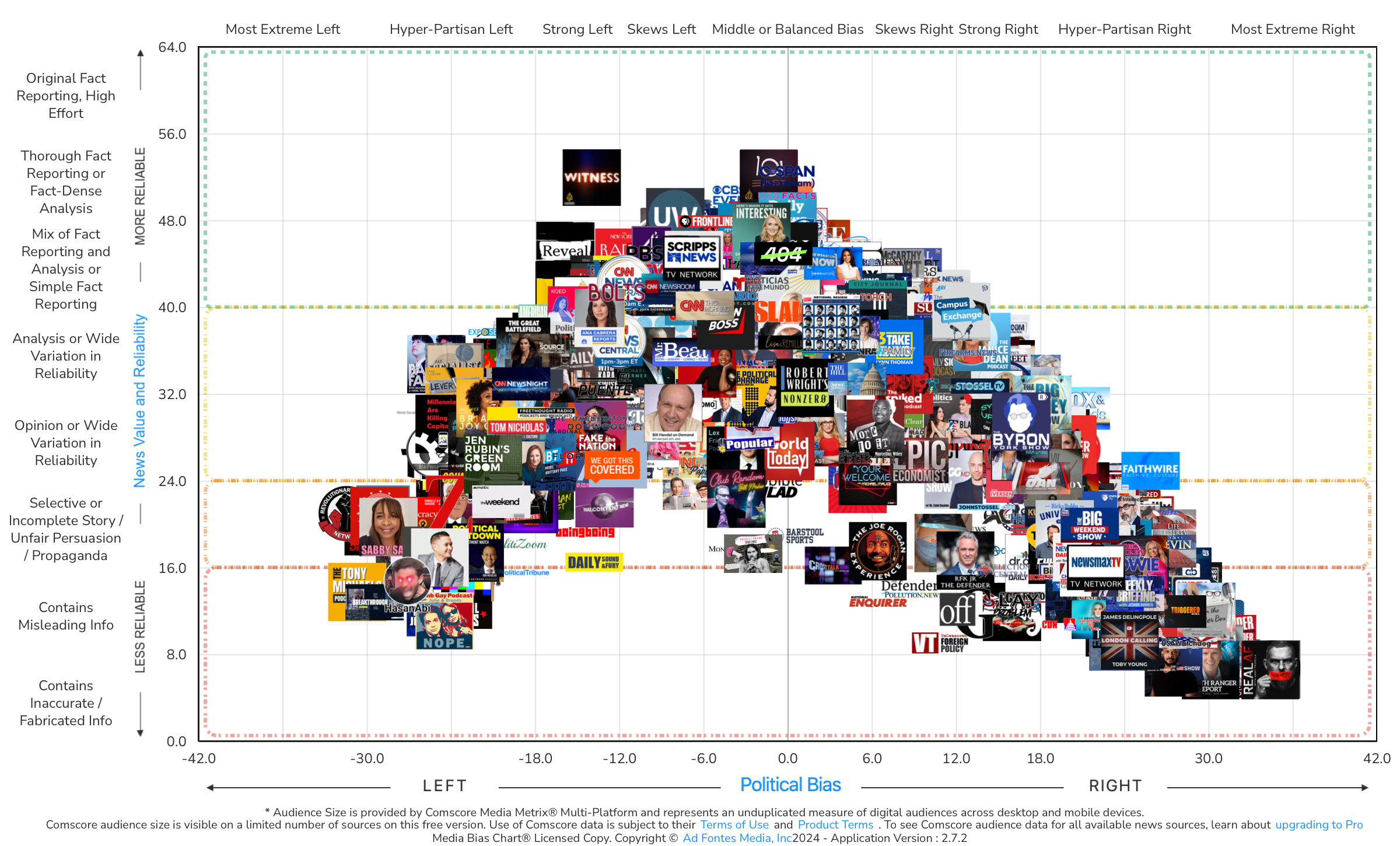
If we added all rated sources to each platform’s chart, the source logos would overlap and appear on top of each other, making the chart impossible to read. The chart pictured above demonstrates this problem. That’s the limitation of a two-dimensional image.
On the monthly charts, we do our best to swap out different logos each month while providing examples of all the different types of sources we rate. These range from mainstream publications to niche websites to local TV programs to popular podcasts.
From a functional standpoint, we choose sources that are spread across the chart, from top to bottom (reliability) and left to right (bias). Of course, if several sources are located on the same spot of the chart, only one of them can be included at a time.
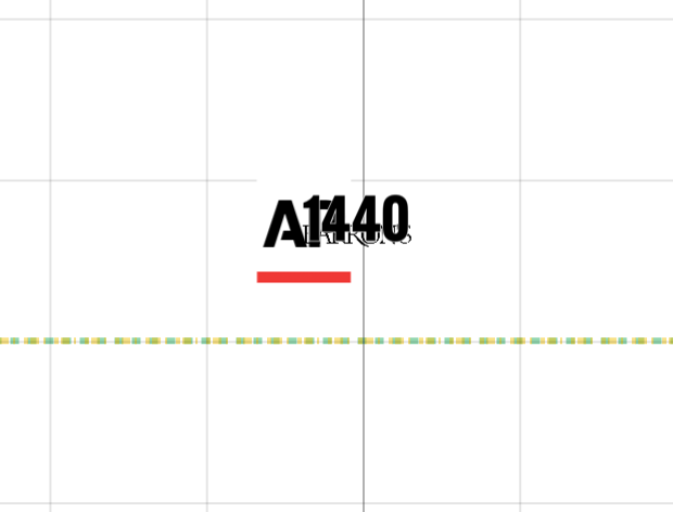
For example, AP, Barron’s and 1440 all appear on the chart in basically the same spot. Only one of those three websites can be included on a chart, in order to see the source logo clearly. We swap out different logos from month to month in an effort to present a variety of sources to our readers.
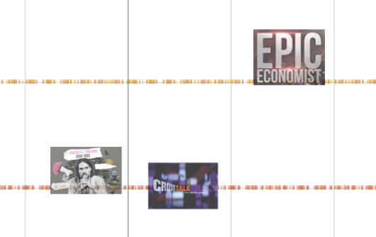
Conversely, if a source’s scores put it in an area of the chart where few other sources fall, then it’s more likely to be included on the chart from month to month. For example, these TV/video shows:
So, if your favorite source isn’t visible on the chart, please be patient. You might see it next month. Or, you can search for it on the Interactive Media Bias Chart® available on the website. It’s free, with limited data and daily search limits. (For expanded access, consider a News Nerd subscription.) We also offer a free app for Apple and Android that contains data on all rated sources (daily search limits apply).
Next week, keep an eye out for the release of our next flagship Media Bias Chart®! Twice a year (in January and August) we release a chart that features sources from all platforms (web, audio, video) in a single image. It’s a popular resource for teachers, librarians and savvy news consumers!
If you want to keep up to date on all of our Media Bias Chart® releases, sign up for our free biweekly email newsletter!


