
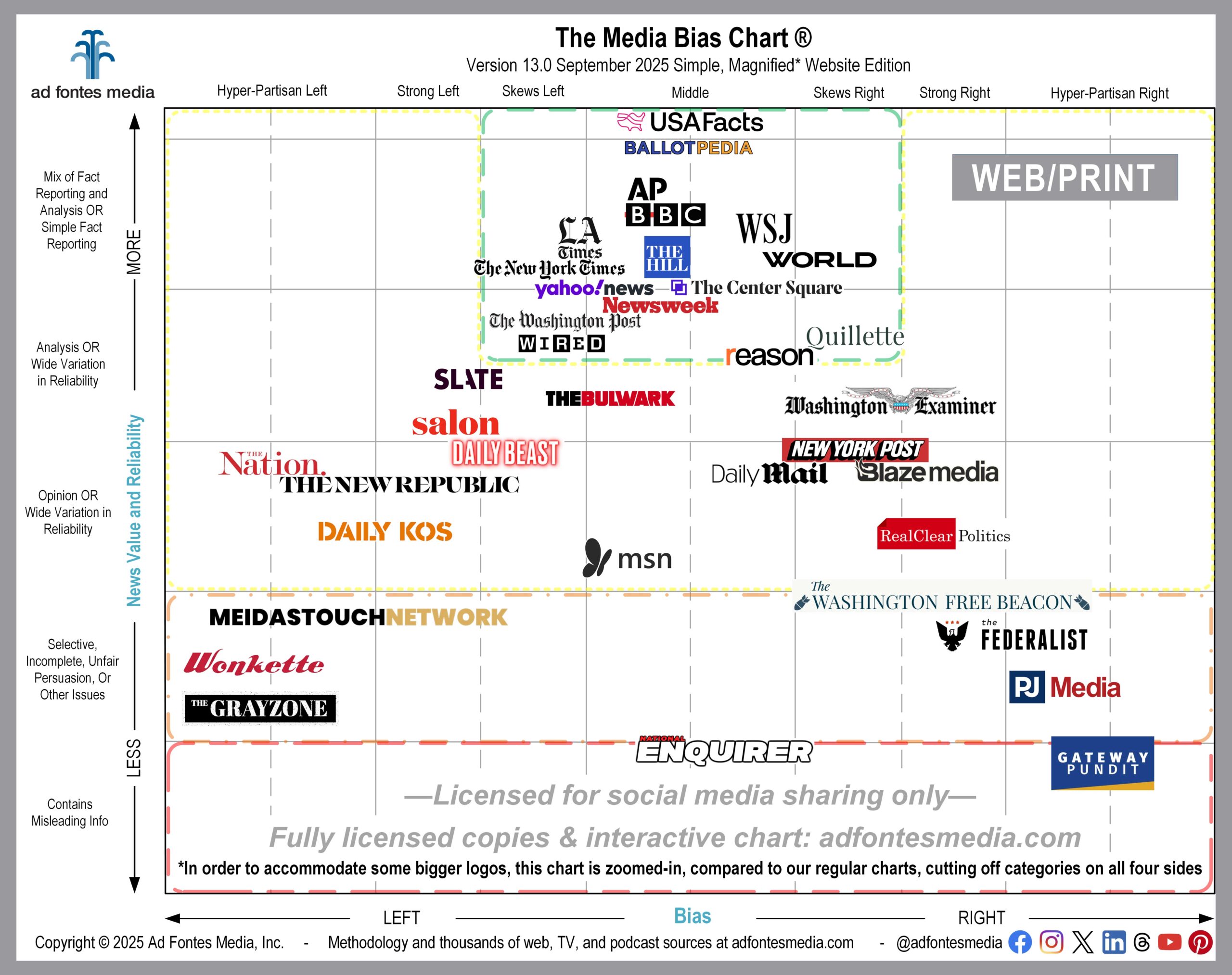
I’m gratified by the thousands of people who regularly use our Media Bias Chart® and share it with others. But I also know that the chart itself can sometimes be difficult to read and understand.
We have data on more than 4,300 news and information sources included on the chart. That’s a lot of valuable information about the reliability and bias of various media outlets. But including that much data into a single chart image has its challenges.
Over the years we’ve heard complaints that the chart is too crowded and the source logos are too small, making the chart difficult to read. Last September, by request, we released our first “simple” Media Bias Chart® that contained some of the major web, podcast and TV/video sources in one image. Because it was so popular, we’ve opted to do that again this year, but instead of one chart, we’re releasing three: one for web sources, one for podcasts and one for TV/video sources.
Today we’re releasing the simple Media Bias Chart® for websites. (The simple podcast and TV/video charts will be published later this month.) Remember, in order to make the logos as large and as readable as possible, we have magnified a portion of the chart and removed the sections around the edges. That means that we have omitted any sources that fall entirely within the “Most Extreme” right and left bias categories and the “Contains Inaccurate/Fabricated Info” reliability category.
We’ve fully rated 2,700 websites, but this simple Media Bias Chart® features only 37 of them (find a list of those 37 here). You can download a free, licensed version of this simple, magnified Media Bias Chart® for websites here!
Here’s a list of the sources that fall within the green box on this chart. Our analyst team has found that these sources are generally reliable and minimally biased:
- AP
- Ballotpedia
- BBC
- LA Times
- Newsweek
- Quillette
- Reason
- The Center Square
- The Hill
- The New York Times
- USAFacts
- Wall Street Journal
- Washington Post
- WIRED
- World News Group
- Yahoo News
These simple charts do help with visibility, but they don’t help us to solve the question we get most often — people who are looking for a particular source, and it’s not included on that month’s chart image. As I said before, we’ve rated thousands of sources, and we have to select only a few dozen of them to put on each static chart in order to keep it readable.
That’s why we created an Interactive Media Bias Chart® and a free app for Android and iPhone that allows you to search for sources by name. Both are free (with daily search limits), but the interactive chart requires a subscription in order to search all 4,300 sources.
If you’re one of the many people who have asked us for a more simple chart containing only the most popular news sources, we hope this meets your needs. Let us know what you think!
And keep up on all of our work by joining our email list! Sign up here if you haven’t already!

Vanessa Otero is a former patent attorney in the Denver, Colorado, area with a B.A. in English from UCLA and a J.D. from the University of Denver. She is the original creator of the Media Bias Chart (October 2016), and founded Ad Fontes Media in February of 2018 to fulfill the need revealed by the popularity of the chart — the need for a map to help people navigate the complex media landscape, and for comprehensive content analysis of media sources themselves. Vanessa regularly speaks on the topic of media bias and polarization to a variety of audiences.
