Why Are There More Sources in the Bottom Right of the Media Bias Chart Than in the Bottom Left?
Author:
Beth Heldebrandt
Date:
05/06/2025
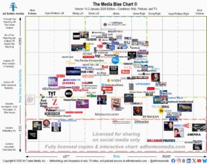
Today we’re releasing the May edition of the Media Bias Chart® for websites/print. This chart features 121 of the more than 2,600 websites our team has rated.
When we release the Web/Print Media Bias Chart® each month, we often hear from people wondering why there are several websites placed in the bottom right of the chart, indicating sources with a right-lean bias that have been found to publish inaccurate/fabricated information, but not in the bottom left.
There are several reasons why this is true. Our methodology requires that each article is rated by three trained analysts: one left-leaning, one right-leaning, and one center. A random sample of articles from a particular source is analyzed, and the weighted average of those articles determines where the source falls on the Media Bias Chart®.
On the May chart, you’ll find eight right-leaning sources in the red box. Ad Fontes Media does not recommend sources in the red box to provide reliable, fact-based information. They are the junk food of a news diet (read more about that here).
In total, we’ve placed 57 websites in the red box, and 54 of those have a right-lean bias. One has a left-lean bias, and you’ll find it on the May chart: Political Tribune.
Individual articles from low-reliability sources have earned bias and reliability scores that plots them throughout the Media Bias Chart®, as you can see in the following image. Each dot on this chart represents an article rated by our team that was published by a source in the red box.
When an entire source lands in the red box, it typically means that around 25% or more of their articles also fall within the red box. An article in the red box contains demonstrable and material statements that are either misleading (8-16) or inaccurate (0-8), according to our analysts.
We have quite a few sources on the left where a lot of their content falls in the orange box (problematic for being selective, incomplete, or unfair persuasion such as name-calling and insults), yet only a small percentage of their content falls in the red box, resulting in an overall source score in the orange box.
To answer the question of why there are more websites on the right in the red box? More of them simply exist on the web. Just because there are two sides of a political axis doesn’t mean they are equal and opposite in every way. (Please note that we’re looking only at web/print sources here; there are several podcasts and a couple of YouTube channels that fall in the bottom left portion of the chart).
Ad Fontes Media does not actively seek out websites that we suspect to have low reliability and are biased to the right. To find the 2,600+ websites we’ve rated, our team has combed the internet and looked through lists of websites from third parties that compile or index sites. We follow various news sources and social media accounts that are likely to turn up information about new websites.
We also rate sources at the request of researchers and the public. If you know of a news website that you believe publishes inaccurate or misleading information, and we haven’t rated it, please let us know at info@adfontesmedia.com!
Sources in the green box (top middle) of the chart are recommended by our team to provide minimally biased and reliable, fact-based information. Here’s a list of all 43 websites/newspapers that fall within the green box on this May version of the Media Bias Chart® (many more websites fall within the green box; they will be included in monthly charts in the future).
- ABC News (website)
- AP
- Arkansas Democrat-Gazette
- Boston Herald
- Breaking Defense
- Christianity Today
- CNBC (website)
- CNN (website)
- Deseret News
- Eco Watch
- Erie Times-News
- FOX 5 New York WNYW
- FOX 8 Cleveland WJW
- Fox Business (website)
- Grist
- Newsweek
- NPR (website)
- Oil City News
- Patch
- Pew Research Center
- ProPublica
- Puck News
- Quillette
- RealClearWorld
- Reason
- Straight Arrow News
- The American Leader
- The Atlantic
- The Center Square
- The Dispatch
- The Guardian
- The Hill
- The New Atlantis
- The New York Times
- The Reload
- The War Horse
- TheGrio
- Univision News
- USAFacts
- Wall Street Journal
- Washington Post
- WIRED
- Yahoo News
If you’d like to see a list of all 121 sources included on the May web/print chart, you can find it on our website. Remember, we choose a selection of sources to include on each month’s chart because it’s impossible to put all of them in a single image.
Six sources make their debut on this month’s chart:
- Brownstone Institute
- Environmental Health News
- FOX 5 New York WNYW
- Granite Post
- Natural Health News
- The American Leader
Don’t see your favorite source on the May chart? You can look up ratings on all sources we’ve analyzed and create custom chart images using our free mobile app available for Apple and Android. You also can access the free version of the interactive chart on the website, which allows access to data on 250 of our top sources. Daily search limits apply.
For expanded access, please consider a News Nerd subscription, which gives you the ability to search all sources we’ve rated and provides many additional benefits.
To keep up on all of our work, join our email list.


