
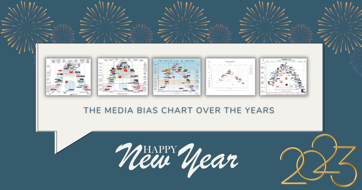
Hey, happy new year! Let’s celebrate and take a moment to look back at the history of the Media Bias Chart. How did your favorite news rating organization get to be so popular?
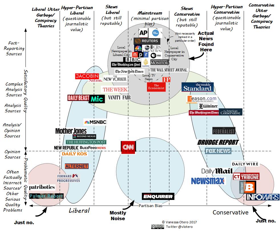
 The Media Bias Chart (MBC) was born from the mind of patent attorney Vanessa Otero in the tumult leading up to the 2016 U.S. presidential election. She recognized that the news landscape was getting more polarized, and at the same time, it was becoming more difficult to distinguish fact from opinion. Deliberately misleading information was spreading, in part due to bad actors preying on our desire to blame the other side – any other side – for what we saw as wrong with our country. Vanessa applied her well-honed analytical skills and logic to create a content analysis and multi-factor testing system that would be transformed into the first Media Bias Chart in the fall of 2016. It was a visual exploration of the bias and reliability of a range of popular media outlets on a liberal-to-conservative, top-to-bottom scale. Center and top were the highest rated and most reliable sources; as the scale slid left or right, so did the bias apparent in the news source; as the scale slid down, so, too, did the reliability of that source. It was the first graphic representation of news source reliability and bias, and it was a conversation starter, for sure. Once it was released, it rapidly gained internet fame, gathering both fans and enemies.
In 2017, the second MBC hit the internet. It was graphically easier to follow, and there was less text on the chart. And perhaps most interestingly, for those folks who were paying attention, some of the sources had moved on the chart itself. What was up with that? Part of the shifts were Vanessa rethinking what should constitute the top score for reliability, and she concluded that it should be reserved for fact reporting, not analysis like it was on the original version. As part of that, within each source, it is important to look at a range of articles; if you only read opinion-based editorials, for example, that is not going to give you a clear overall picture of the bias or reliability of a source. Also, the rating of each non-opinion article can vary, so it is important to look at a range of articles from each source for accuracy.
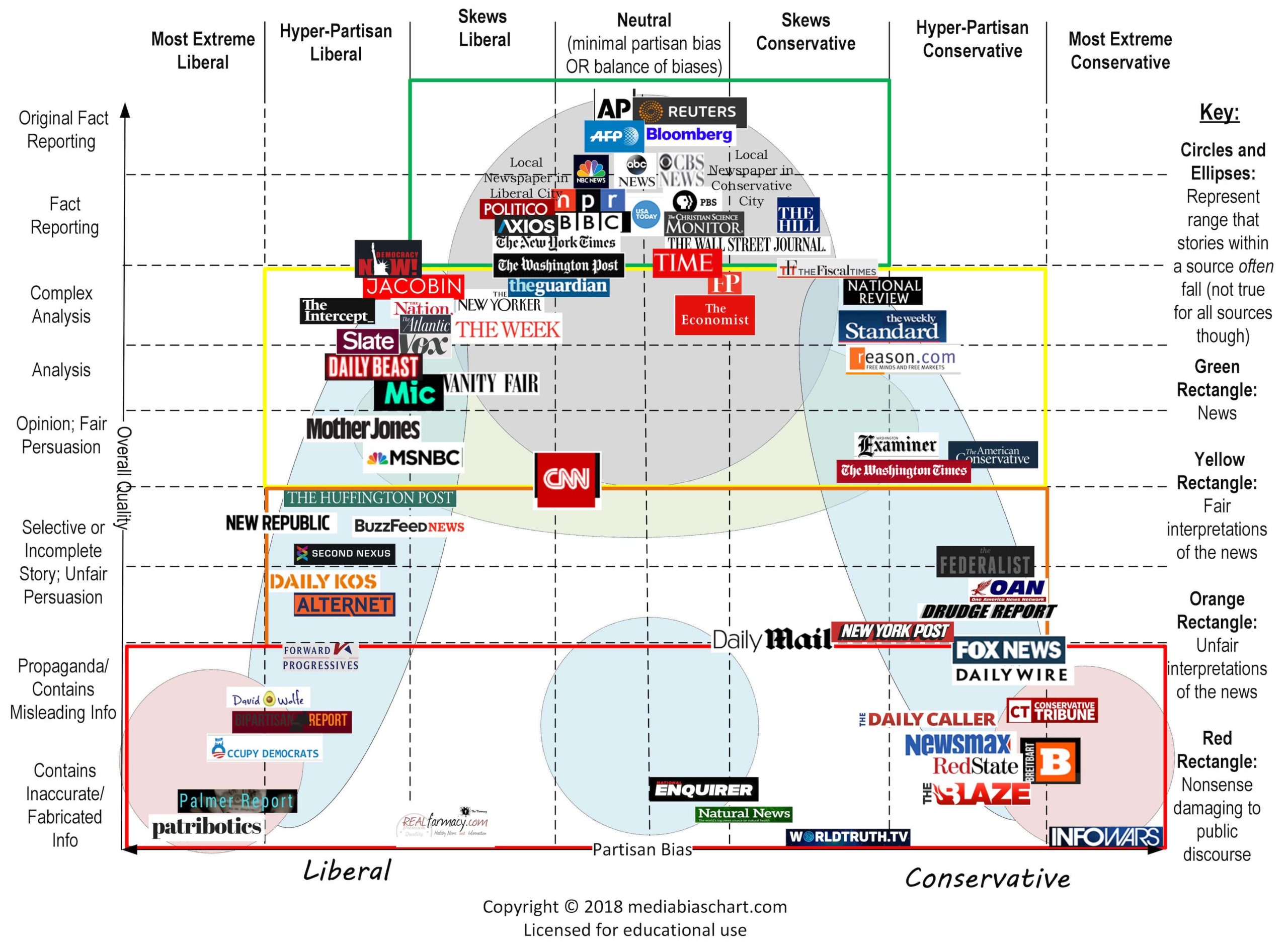
Version 3.0 came out later in 2017, adding more sources as well as the color coded boxes that are still on the chart today. Insider tip, as analysts parse each article, we laterally read to see how a source presents a story differently or to check out a reputable fact-checking site (Poynter, Politifact), but most of the time spent reading each article focuses on phrasing, images, and headlines; is the article written to make the reader think that it is fact or opinion? The way it is presented has a lot to say about its intent.
2018 brought version 4.0: the “blue chart.” The liberal and conservative labels were replaced with left and right, which are broader terms. It became friendlier for folks who needed vision assistance. It also introduced the coordinate system, ranking reliability from 0 (the least reliable) to 64 (the most) and the left to right bias scale of -42 (most extreme left) to 42 (most extreme right). The coordinate system is what we still use to add accuracy to our ratings, and this refinement also shifted some of the existing sources on the chart.
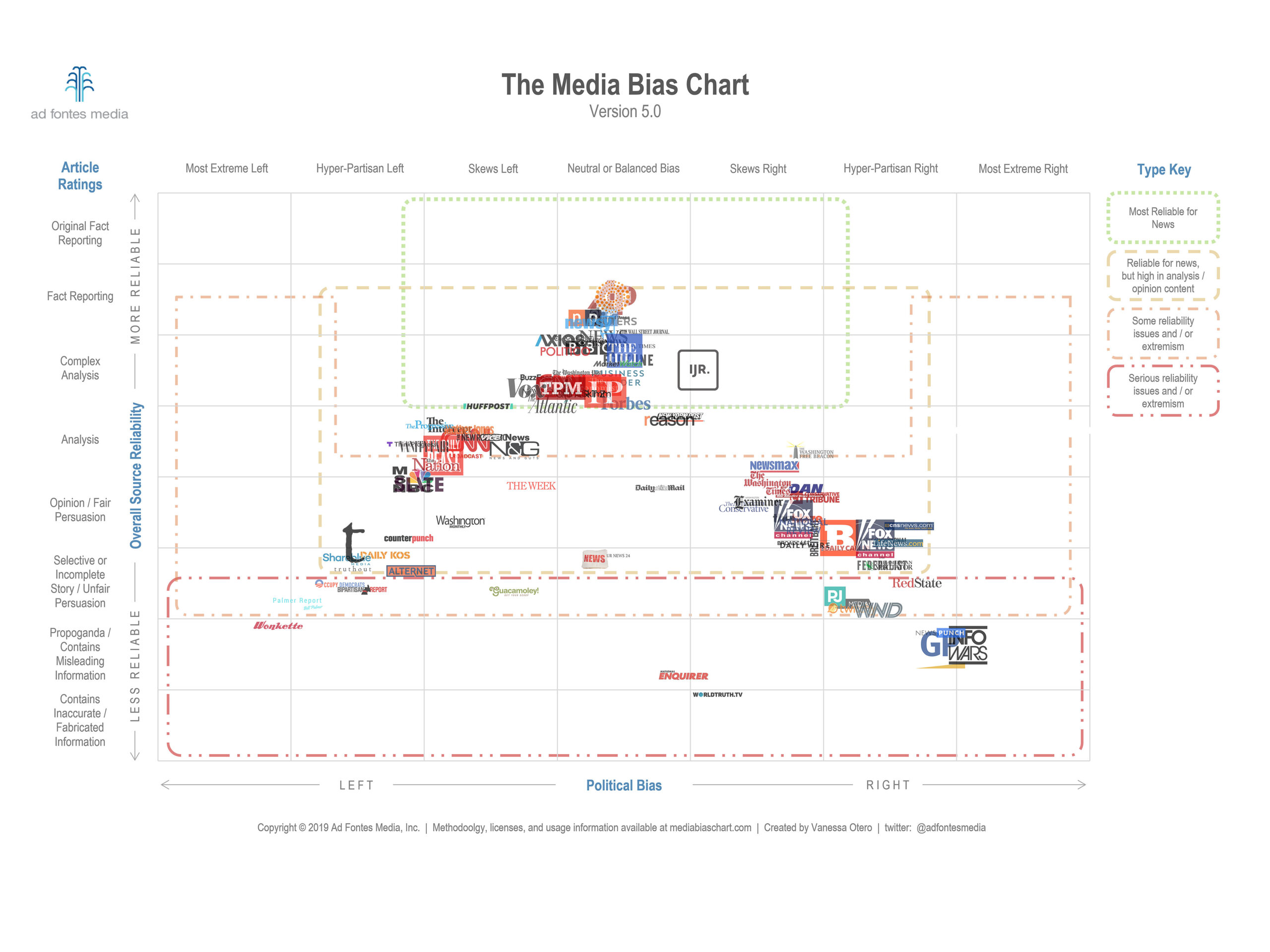
2019 brought some exciting changes to Ad Fontes Media as the first group of analysts found their way to rating the news. Vanessa trained this inaugural batch in the methodology that she developed, looking to see if the skills were transferable – and they were! The analysts successfully rated article after article, applying her methodology, and the results were a slightly different view of the news landscape, as each article was rated by groups of three people that include a left lean, a center, and a right lean. The result was a more balanced view of each story. Version 5.0 of the chart came out in 2019 with the work of the new analysts.
 In the fall of 2020, Vanessa took a leap and left her job as a patent attorney to develop Ad Fontes Media full-time, and an even larger group of analysts found their way to the home of the Media Bias Chart. We received training in Vanessa’s methodology and began rating articles live over Zoom in balanced, three person pods of left, center, and right leans. How often do you get to talk to someone of a different political persuasion about a heated topic without arguing? That’s what it’s like: our training provided the vocabulary to discuss hot topics, and we all came to the table with the desire to get to the heart of an issue. When we do disagree, we can pass the article to another pod; we don’t leave stories hanging because they are too politically fraught. Version 6.0 arrived that year with even more sources rated, with the help of several full-time employees who started that fall as the company kept growing. Some were from that year’s batch of analysts, and most of us – analysts and full-time folks alike – are still here.
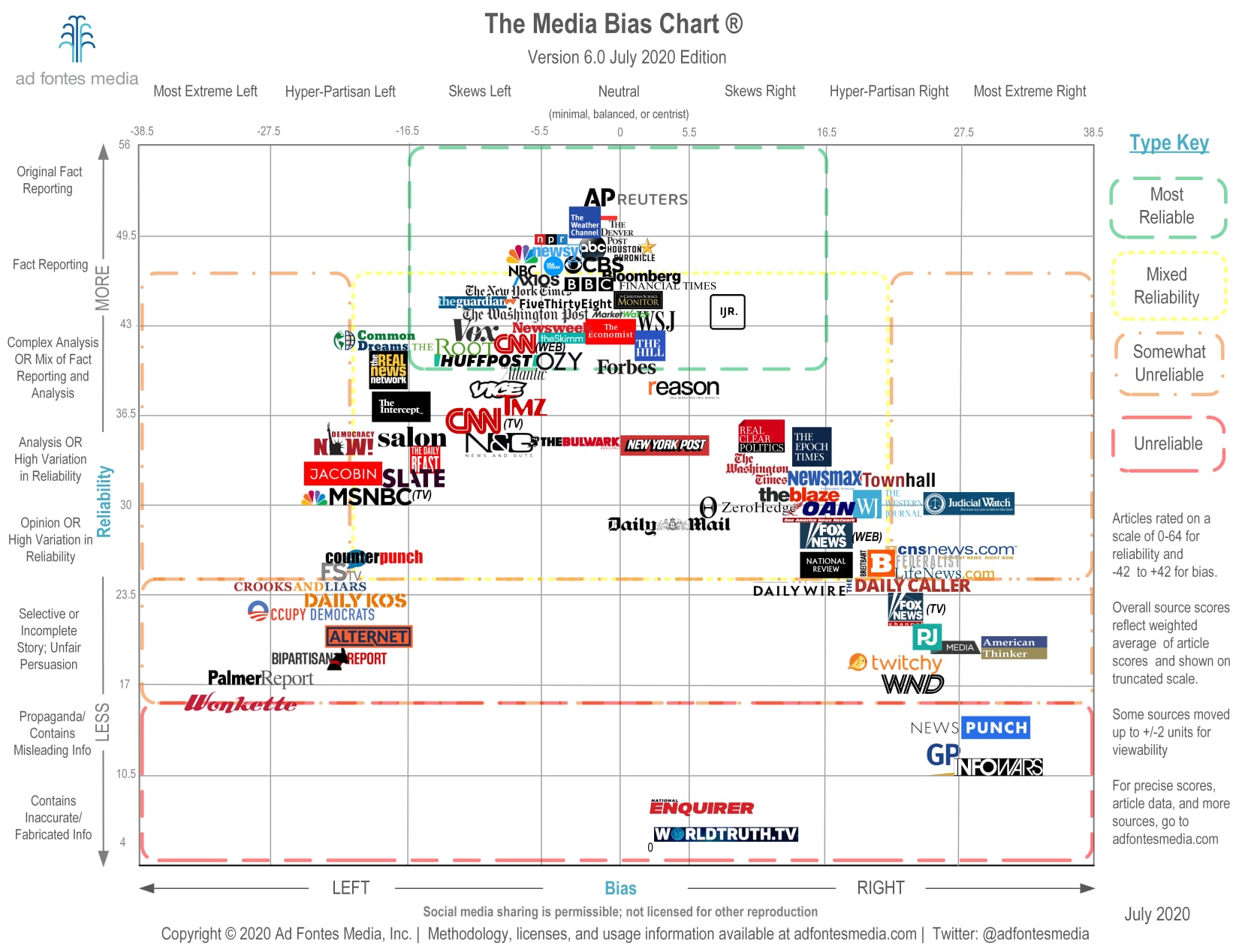
Version 7.0 appeared in January 2021, and from then on, the flagship chart – the chart that showcases the news articles and sites that the original chart featured – came out twice a year, adding more sources as Ad Fontes Media grew and more analysts came onboard. Version 8.0, released in September 2021, was the first to include ratings for podcasts and TV shows. Version 9.0 came out in January 2022 and version 10.0 in August 2022, adding even more sources.
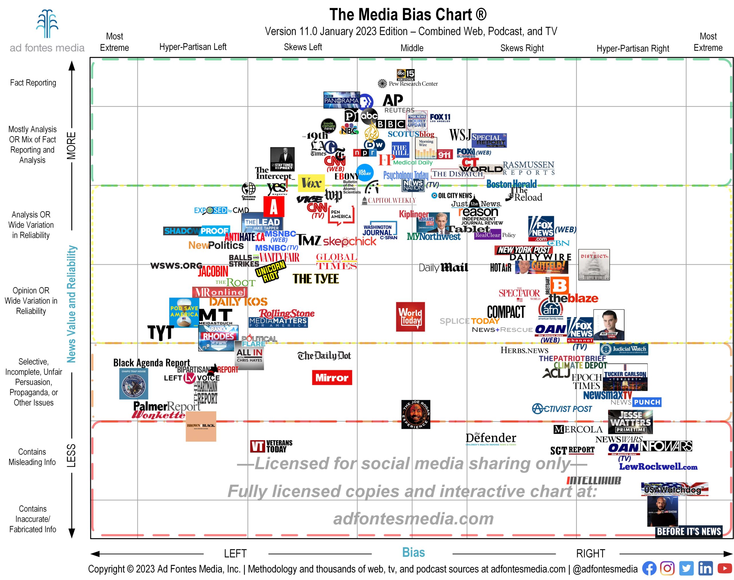
Version 11.0 is out now! Get your FREE DOWNLOAD here.
As the company grew, we received a lot of suggestions, and pursued one in particular – in the fall of 2022 we hired several bilingual analysts so that we could expand our efforts to Spanish publications. The fruits of that labor will be coming out later this year.
______
We’ve gone from one person rating the news on her own and working solo to refine her methodology to over four dozen analysts of differing political leanings working each week to rate new sources. In 2022, we surpassed over 2,000 sources represented on the chart, and we are gaining momentum with every new article and episode rated.
So why is this relevant?
It is fun to look back on how far you’ve come, personally and professionally. Ad Fontes Media started out as one woman’s response to the shifting media landscape, but she didn’t stop at sharing the information with her own friends, who likely would have supported her points of view. She released it into the world, and took the criticism and the feedback and improved her methodology. Her vision of helping people to see the reliability and bias in the news they consume has led to Ad Fontes working with a wide range of Americans, from middle school teachers to Fortune 500 companies, all with the same goal of imparting to others the skills to recognize bias and reliability for themselves.
This is more than just a “Look at us, we’re so great!” Though it is, a little. Each person at Ad Fontes is here because we believe in the mission that led Vanessa to start this venture in the first place, to improve society by providing impartial ratings of the news so that folks can determine the reliability of the information that they consume. Together we have done some pretty impressive things and we have exciting plans for the future. We can’t wait to see where 2023 takes us. We’re not much for resolutions, but we have one for you – won’t you add checking the reliability and bias of your news sources to your goals for this new year?

Sara Webb
Sara Webb is a cybersecurity consultant and former high school librarian from Philadelphia, PA. She holds an M.S. in Informatics and an M. Ed in School Library and Information Technology, and has been a media literacy educator for over a decade. Sara started with Ad Fontes Media in July 2020 as a Media Analyst, and she currently continues in that role and as in-house Media Literacy Specialist. When not engrossed in media literacy projects, Sara can be found at the barn with her ex-racehorse Homer, or training her corgis for dog agility competitions.
