
A list of names connected to the Jeffrey Epstein-Ghislaine Maxwell sex trafficking case was released by a judge this week, and the anticipation of the release generated much scrutiny in the media. Our analyst team took a closer look at several articles from various media outlets and found solid examples of balanced and factual reporting in this week’s Topic of the Week.
Each week, Ad Fontes Media chooses a widely covered trending news topic to share insight into how our analysts rank news coverage for the Media Bias Chart®. To do this, we select six articles reporting on the same story from different outlets to show how each treated the subject.
Once we choose a set of articles, pods of analysts with diverse political perspectives (one right leaning, one center, and one left leaning) read each article and use Ad Fontes Media’s content analysis methodology to determine its bias and reliability. These ratings inform the articles’ placement on that week’s special Media Bias Chart.
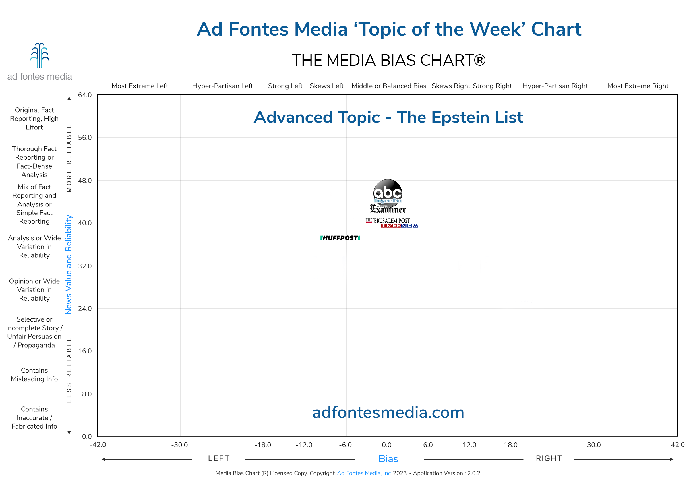
The articles rated by our analysts were “Bill Clinton’s office doesn’t object to imminent unsealing of Jeffrey Epstein court documents” from The Washington Examiner, “Nearly 200 names linked to Jeffrey Epstein expected to be made public” from The Guardian, “Marjorie Taylor Greene Attacks Bill Clinton’s Jeffrey Epstein Ties, Ignores Trump’s” from the Huffington Post, “Bill Clinton, Prince Andrew expected to be named in unsealed Epstein documents” from The Jerusalem Post, “Court documents naming Jeffrey Epstein’s associates to be unsealed: What to know” from ABC News, and “Hillary Clinton Turns Off Twitter Comments Amid Husband Bill Clinton’s Jeffrey Epstein List Link” from Times Now World. The bias and reliability scores for each of these articles can be found on our Topic of the Week page.
At this point, we usually pick two articles and take a deeper dive into why they received the ratings that they did, but this week, many of them ended up with similar scores, so we are going to focus on a different question: What does an article look like when it has minimal bias?
First, Ad Fontes analysts judge an article to be middle or center-leaning if its bias scores are anywhere from -6 to 6 on the chart. This means bias minimal enough that the content of the story is unaffected.
Can an article show no bias? Of course, though it is more often that a balanced/middle bias comes from an article that presents both sides of the story and adds factual reporting and analysis for context. We are going to look at the two articles that were rated both balanced/middle for bias and highest for reliability: the pieces from ABC News and The Guardian. Our analysts assigned both of these articles a bias score of 0 and a reliability score above 45.
ABC News is one of the more reliable and least-biased sources we have rated. It lives in the center of the chart, toward the top, with an aggregate bias of -3.01 and reliability of 45.42, a mix of fact reporting and analysis. This article tells us right in the headline (“what to know”) that it is going to break down the story, and it delivers, breaking down the facts of the case, adding some pieces of the story that are already known (the flight log!) for context, and sprinkling in some analysis to connect the dots.
This story does present two sides: Ms. Maxwell called one element of the tale a “transparent ploy by [Giuffre] to increase media exposure for her sensational stories through deposition side-show,” whereas Ms. Giuffre’s team rebutted with calling the same element “highly relevant” and “important to the fundamental claims and defenses” to the case. For more details, of course, read the article, and mind the balanced reporting.
The Guardian also enjoys a spot near the top center of the chart but slightly below ABC, with an aggregate bias of -7.71 (skews left) and reliability of 41.28, placing it in the same fact reporting and analysis segment of the chart as the previous source. This article is more succinct than its counterpart, and much more factually based.
To counter its concise nature, there are many links for further reading in the text, leading to other Guardian articles, an ABC News article, and most interestingly, from Casetext, an AI-based legal assistant app from information conglomerate Thomson Reuters; in this case, it summarized an earlier court case pertinent to this story (pro tip: an article that links to external sites of similar reliability shows that it also cares about using trustworthy sources). This article is quite factual without assigning bias: a true 0.
These are just two examples of the thousands of articles our analysts have rated for reliability and bias. If you want a look at the larger media landscape or are curious to see how our高仿迪奧
analysts have rated your favorite sources, head on over to our website and check out the resources we have available. And don’t forget to come back for another examination of the Topic of the Week.
And if you want to stay informed on all of our amazing work, join our free mailing list!
 Sara Webb is a cybersecurity consultant and former high school librarian from Philadelphia, PA. She holds an M.S. in Informatics and an M. Ed in School Library and Information Technology, and has been a media literacy educator for over a decade. Sara started with Ad Fontes Media in July 2020 as a Media Analyst, and she currently continues in that role and as in-house Media Literacy Specialist. When not engrossed in media literacy projects, Sara can be found at the barn with her ex-racehorse Homer, or training her corgis for dog agility competitions.
