The thing that comes up most often when I discuss the media with my family and friends is the difference between fact and opinion. These days, it can be difficult to find a news source that gives you the facts of the story without including a healthy dose of opinion.
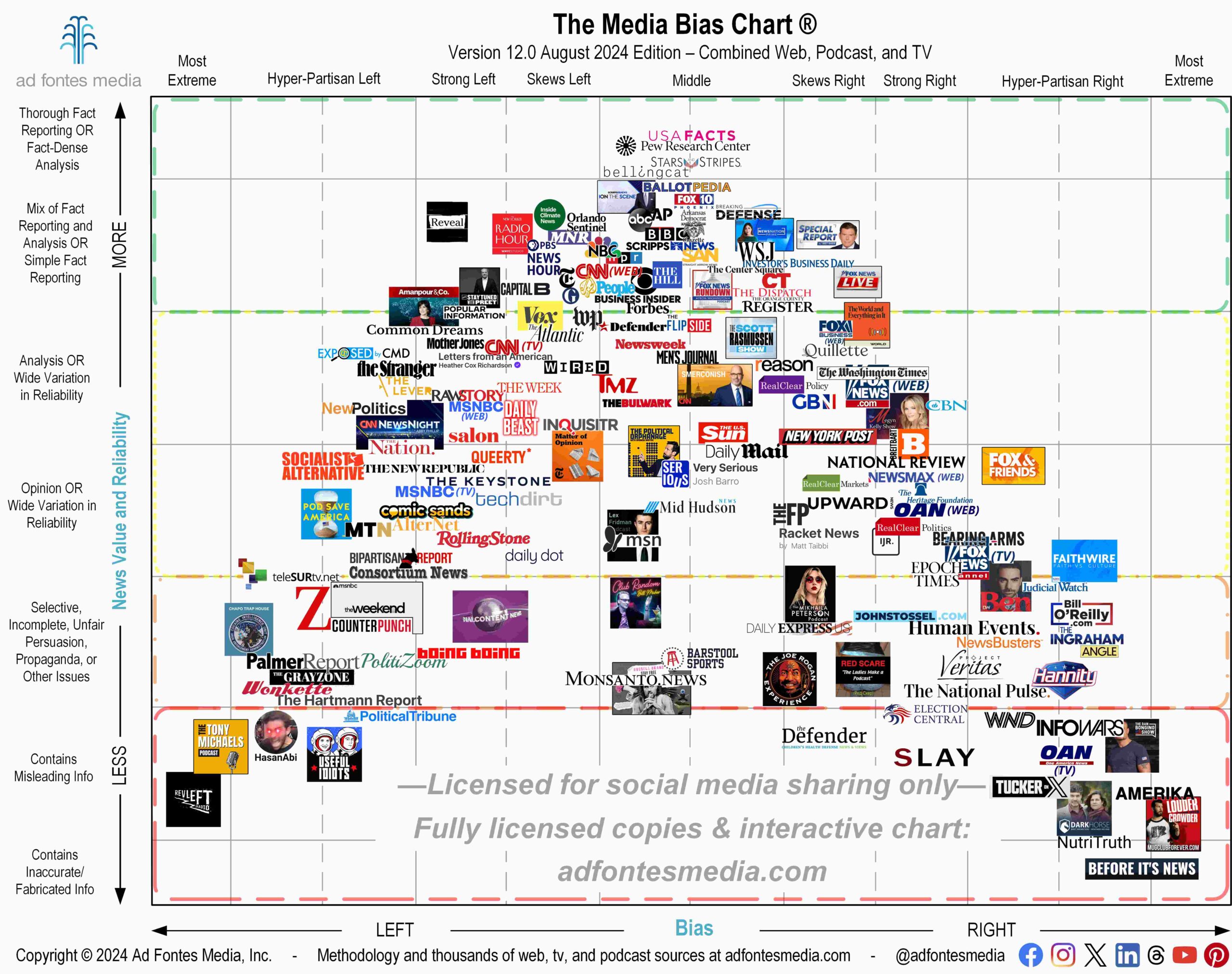
Those of you familiar with the Media Bias Chart® know that the vertical axis measures the reliability of sources, with fact-based reporting at the top, analysis and opinion pieces in the middle, and stories with propaganda and inaccurate information at the bottom.
Many of today’s news sources fall within the analysis or opinion sections because they go beyond the facts in their reporting, and that’s OK. Analysis can provide needed background information and context so we can better understand the news of the day.
When news coverage crosses into opinion, however, problems can arise. Our analysts often find unfair conclusions drawn from the facts, as well as “reporting” designed to appeal to your emotions. Any writer or host can twist the facts to fit the narrative they want you to believe.
Let’s start with some obvious examples of fact and opinion statements in online news reporting last week.
Fact: “Donald Trump became the first former president to be convicted of felony crimes Thursday as a New York jury found him guilty of falsifying business records in a scheme to illegally influence the 2016 election through hush money payments to a porn actor who said the two had sex.” (Associated Press)
Opinion: “He failed upward into a TV career, and now, he’s so toxic that even ‘Dancing with the Stars’ (probably) wouldn’t touch him. And yet, he can still run for president.” (Daily Beast)
The tone of those articles is evident from the start. One is focused on reporting what happened. The other has an obvious opinion about Trump and his future in politics.
Now, let’s look at examples from TV. Many of the programs found on cable news fall into the analysis and opinion categories (or below) of the Media Bias Chart®. These shows often start off with the facts of the story and then turn to a panel of “experts” to tell you what they think about it.
I often tell my family and friends that if the program has the host’s name in the title, then it most likely gives you much more opinion than facts. This chart shows ratings for a sample of shows from MSNBC, CNN, Fox News and Newsmax:
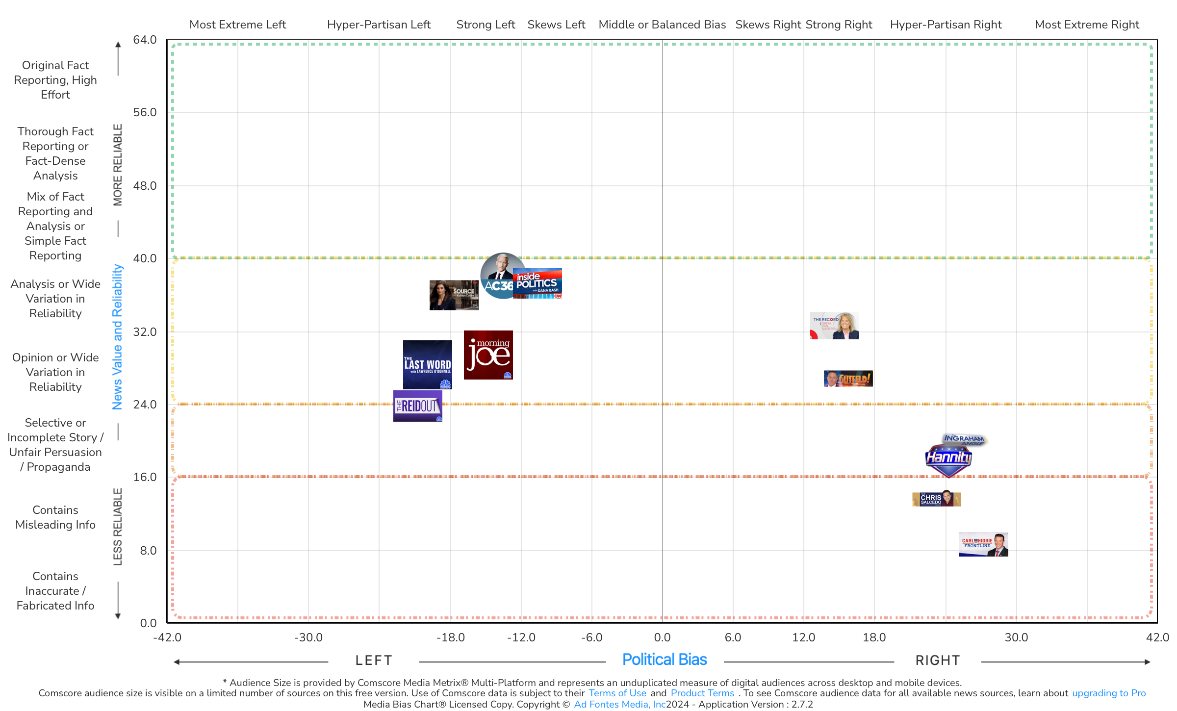
When the news about the verdict in the Trump trial broke last week, I watched several of these cable news networks. Each of them started by sharing the facts: Former President Donald Trump was found guilty of all 34 felony counts. Then each brought in “experts” to discuss why they thought it was good/fair or why they thought it was bad/unfair. The facts of the story took less than five minutes of the program; the rest of the hour (or several hours) was filled with analysis and opinion.
As explained in a recent blog post, not all cable news TV programs are the same. Our analyst team ranks fact-based news coverage higher on the chart, while opinion-based coverage falls within the analysis or opinion sections of the chart. The more facts included in a particular broadcast, the higher reliability rating the program would receive, according to our methodology.
It’s not a surprise that the most fact-based stories have the least amount of bias. Facts aren’t biased; they simply state what happened (truthful and verifiable). Sources that fall at the top middle of the Media Bias Chart® tend to have the most unbiased, factful reporting.
If you have friends or family who say, “I only watch the news I agree with,” they’re not talking about fact-based reporting. They’re talking about media that expresses opinions about the news — opinions that likely appeal to their emotions and confirm what they already believe.
I hope this explains the difference between facts and opinion in journalism and helps to make you a more savvy news consumer. We welcome your comments and feedback! And if you want to get a free biweekly newsletter via email that highlights the work of our team and includes images of the various charts featured each month, sign up here.
 Beth Heldebrandt is a Media Research Specialist at Ad Fontes Media. She has more than 30 years of experience in the fields of journalism and public relations, and was an adjunct instructor of journalism for 17 years at Eastern Illinois University. Beth has a B.A. in journalism from Southern Illinois University-Carbondale and an M.A. in English from Eastern Illinois University. She’s a mom and grandma, and enjoys traveling, puzzles and reading.