Start the Year With a Healthy News Diet
Author:
Beth Heldebrandt
Date:
01/23/2025
Many people make new year’s resolutions related to their diet, but what about your news diet? Ad Fontes Media’s new flagship Media Bias Chart® is a wonderful guide to help you choose healthy sources of information in 2025.
Since this year is also the beginning of a new presidential administration, political news is especially prevalent. In our polarized environment, it can be hard to stay both well-informed and sane unless you keep your news diet healthy.
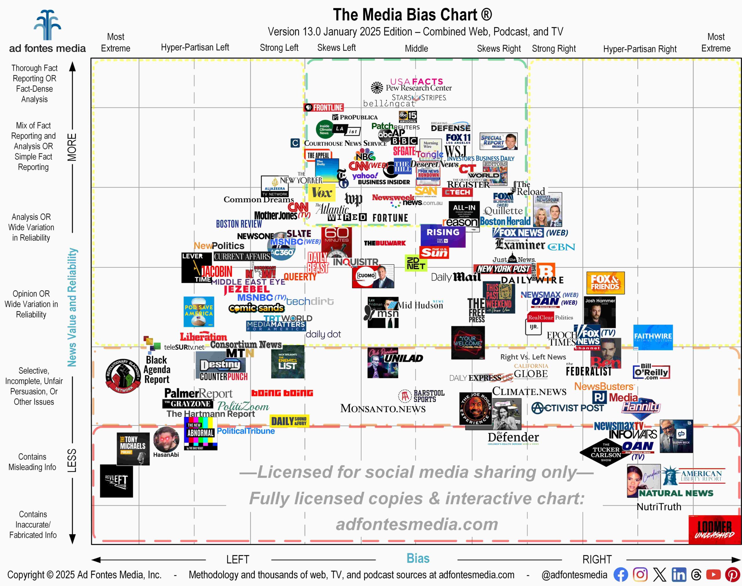
The flagship Media Bias Chart® includes sources from various types of media all in one image, and it’s released only twice per year, in January and August. During the rest of the year, we produce monthly charts that are specific to web/print, podcast/audio and TV/video.
With each chart release, the questions we get most often are about which sources are the “best” — the least biased and most reliable to give you verifiable facts. In order to help you determine that at a glance, the Media Bias Chart® is divided into different colored sections.
Sources in the green section of the chart are the fruits, vegetables, and lean protein — the ones we actively recommend to provide fact-based, reliable and minimally biased or balanced information for a healthy news diet.
Sources in the orange and red sections are the candy (or junk food that’s even worse) — the ones we actively do NOT recommend as reliable information sources. They can be very satisfying to consume but are generally unhealthy, especially if you’re having candy for breakfast, lunch and dinner.
Sources in the yellow section are like bread and pasta — they can be heavy with analysis and opinion, and they will fill you up with information, but one cannot live on bread alone. We suggest caution and additional inspection of sources in the yellow section, for various reasons. The content may vary widely in reliability (for example, some episodes of a podcast may be highly reliable and other episodes less so). Or the source may have high levels of bias even though their content is generally reliable. So remember, use caution when consuming information from sources in the yellow section of the Media Bias Chart®.
To kick off 2025 with a healthy news diet, we encourage you to try out the sources in the green “recommended” section, even if you haven’t consumed them before. Relying on these sources for information regularly will make you a healthy and informed media consumer.
Some of them have a bias to your opposite political side, because the green box includes “skews left” and “skews right” (but not “strong left” or “strong right”). Being exposed to the reliable, but a-little-biased-to-the-other-side content can help keep you from getting stuck in a filter bubble.
To get you started on a healthy news diet, below is a list of all sources on this flagship chart that fall within the green box. Keep in mind that these are only a sample of the sources our team has rated. More “recommended” sources will be highlighted in our monthly charts beginning in February.
- ABC 15 Arizona KNXV
- ABC News (website)
- All In Podcast (All-In with Chamath, Jason, Sacks & Friedberg)
- AP
- BBC
- Bellingcat
- Boston Herald
- Breaking Defense
- Business Insider
- CBS News (website)
- Christianity Today
- CNN (website)
- Courthouse News Service
- CTech
- Deseret News
- Fortune
- Fox 11 LA KTTV
- Fox Business (website)
- Fox News: Special Report w/ Bret Baier (TV)
- Fox News Rundown: From Washington (podcast)
- Inside Climate News
- Investor’s Business Daily
- LAist
- Morning Wire (podcast)
- NBC News (website)
- news.com.au
- Newsweek
- NYT: The Daily (podcast)
- Orange County Register
- Patch
- PBS: Frontline (TV)
- Pew Research Center
- ProPublica
- Reason
- Reuters
- SF Gate
- Stars and Stripes
- Straight Arrow News
- Tangle
- The Appeal
- The Atlantic
- The Editors (podcast)
- The Guardian
- The Hill
- The New York Times
- The Quillette
- The Reload
- USAFacts
- Vox
- Wall Street Journal
- Washington Post
- Wired
- World News Group
- Yahoo News
This flagship chart contains a total of 159 sources: 117 from web/print, 20 podcast/audio and 22 TV/video programs. It includes a mix of national, international and local sources.
Click here to access a FREE download of the chart to print or to use in a class or presentation. We know it can be difficult to see the individual logos, so a full list of all sources (in the green, yellow, orange and red boxes) is available here.
All together we’ve fully rated about 4,000 sources. Search for your favorites on the new Interactive Media Bias Chart® that was launched earlier this month. It’s free, but there are limits in terms of how many searches you can conduct per day and how much source data you can access.
To get expanded access, you’ll need a News Nerd subscription. Our News Nerd subscribers can search all 4,000 sources our team has rated, with other added benefits!
You can also search all sources on our app available for iPhone and Android. Download the app from the App Store and Google Play. Daily search limits apply.
Want to stay informed on all of our amazing work? Join our free email list!


