
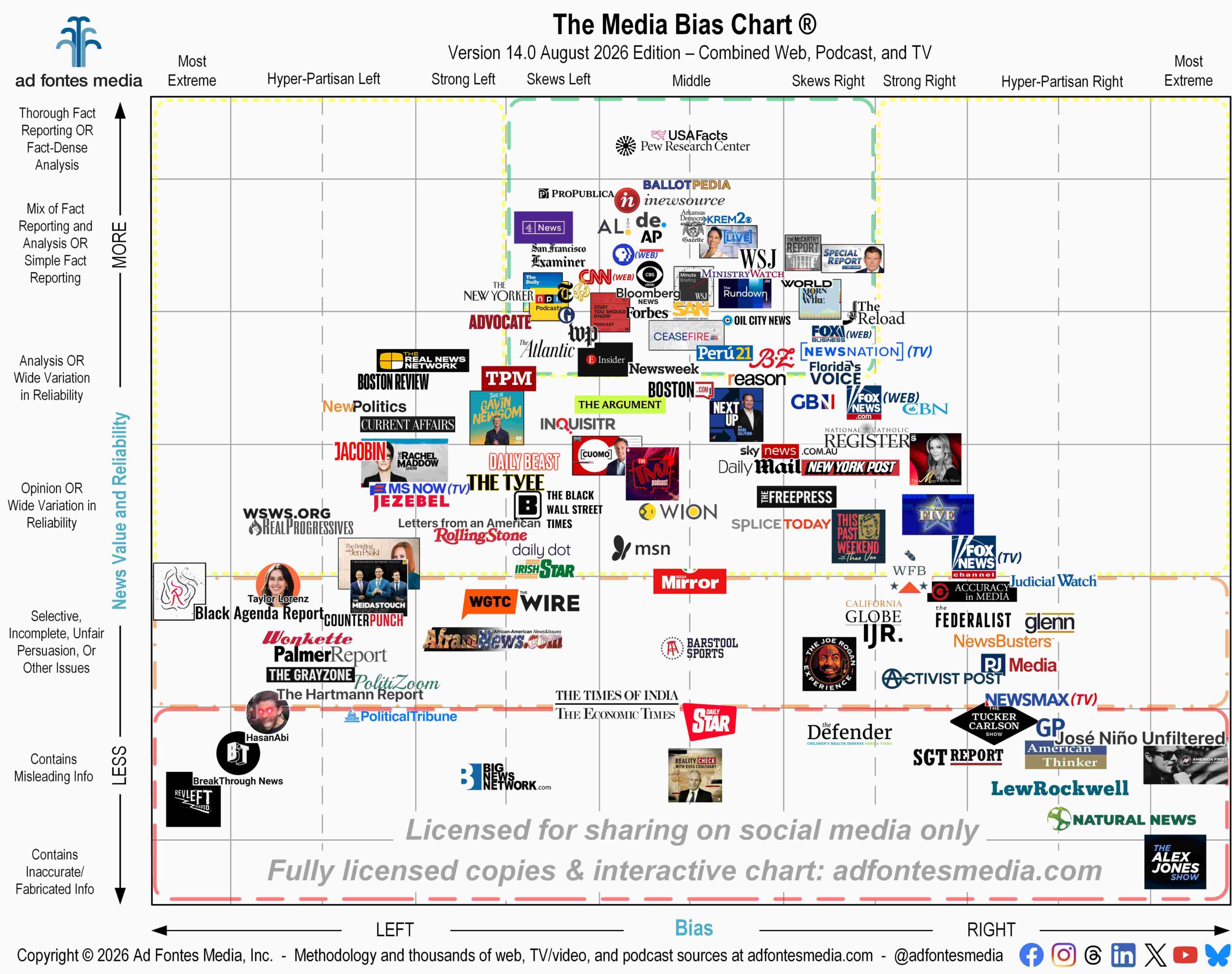
Ad Fontes Media has released the new flagship Media Bias Chart®, which includes 134 sources from various types of media all in one image. You might be used to seeing our monthly charts, which focus specifically on one type of media — websites, podcasts and TV/video. This chart, released only twice per year, contains a sample of all three.
The flagship chart is a great representational sample of the media landscape from top to bottom and left to right, but it’s by no means complete! As with any two-dimensional image, only so many logos can be displayed at a time. This flagship chart contains 98 websites, 17 podcasts and 19 TV/video programs. This is a small percentage of the number of news and news-like sources that our team has rated (we’ve rated 4,814 in all!). Let’s break it down:
Websites: Our analysts have fully rated 2,990 websites. This flagship chart contains 98; that’s 3.3% of all sites rated by our team. On this chart you’ll find local news sites like Arkansas Democrat-Gazette, Boston.com and Delaware Online; national news outlets like Associated Press (AP), The New York Times, The Atlantic and Newsweek; Substacks such as Letters from an American by Heather Cox Richardson and The Hartmann Report; and other websites that publish news-like content, like Straight Arrow News, ProPublica and USAFacts.
Podcasts: We’ve fully rated 910 podcasts, and this chart contains only 17 (that’s 1.9%). You’ll find podcasts from national news outlets like NPR and the Wall Street Journal, as well as shows from well-known people like Gavin Newsom, Nicholas Fuentes, Megyn Kelly and Joe Rogan.
TV/video: Our team has fully rated 913 TV shows and YouTube channels. This chart contains 19 of them (2.1%). You’ll see well-known shows and channels from people like Alex Jones, HasanAbi (Hasan Piker), Tucker Carlson and Taylor Lorenz. You’ll find shows from C-SPAN, Fox News, MS NOW and NewsNation. And you’ll see overall network ratings for Fox News, MS NOW, Newsmax and NewsNation. The TV network scores are an average of all the individual shows we’ve rated from those networks. Please note that the Fox News website is also on this chart, so it’s important not to confuse the two logos.
Remember: 97.2% of the news and news-like sources we’ve rated are NOT on this chart, because they just won’t fit. These include BBC and Reuters, ABC News and NBC News, and thousands of others. The CNN website is on the chart, but the TV network and individual shows are not.
These are the difficult choices we have to make when putting together a two-dimensional chart. We’re forced to choose some sources and leave out others that fall in the same general area of the chart, because there’s only room for one source logo. (We know it can be difficult to see the individual logos that are on the flagship chart, so a list of them is available here.)
Sources in the top middle portion of the chart (in the green box) have been rated by our team to be fact-based and minimally biased. Forty-five sources on the flagship chart fall within the green box:
- Al Jazeera (website)
- AL.com
- AP | Associated Press
- Arkansas Democrat-Gazette
- Ballotpedia
- Bloomberg News
- BZ Berlin B.Z.
- C-SPAN: Ceasefire
- CBS KREM 2 News Spokane
- CBS News (website)
- Channel 4: Channel 4 News
- CNN (website)
- Delaware Online
- Florida’s Voice
- Forbes
- Fox Business (website)
- Fox News: Special Report w/ Bret Baier
- i24: The Rundown
- iNewsource – San Diego
- MinistryWatch
- Morning Wire
- NewsNation TV Network
- NewsNation: NewsNation Live With Nichole Berlie
- Newsweek
- NPR Podcasts
- NYT: The Daily
- Oil City News
- PBS
- Peru21
- Pew Research Center
- ProPublica
- SF Examiner
- Straight Arrow News
- Stuff You Should Know
- The Atlantic
- The Guardian
- The Insider from The Economist
- The McCarthy Report
- The New York Times
- The Reload
- USAFacts
- Wall Street Journal
- Washington Post
- World News Group
- WSJ: Minute Briefing
You can find BBC, Reuters and other sources not included on this chart on the Interactive Media Bias Chart® and on our mobile apps for Apple and Android (download them for free on the App Store and Google Play). Look them up!
The free Interactive Media Bias Chart® provides access to only 250 of our top sources, and like the mobile app, there are limits in how many searches you can conduct per day. To get expanded access, you’ll need a News Newbie or News Nerd subscription. Our subscribers can search all 4,800 sources our team has fully rated, with other added benefits, including access to our weekly Navigating the News sessions with Ad Fontes Media founder and CEO Vanessa Otero!
If you’d like a copy of the flagship chart for your own reference or to use in a class or presentation, you can download it for free here. You can also order a large, 18-inch by 24-inch poster of the new flagship chart on our website.
Want to stay informed on all of our amazing work? Join our email list!
 Beth Heldebrandt is Director of Communications at Ad Fontes Media. She has more than 30 years of experience in the fields of journalism and public relations, and was an adjunct instructor of journalism for 17 years at Eastern Illinois University. Beth has a B.A. in journalism from Southern Illinois University-Carbondale and an M.A. in English from Eastern Illinois University. She’s a mom and grandma, and enjoys traveling, puzzles and reading.