Why is The Daily Mail Where it is on the Media Bias Chart?
Author:
Beth Heldebrandt
Date:
08/13/2024
The questions we get most often are about why a particular source is placed on the Media Bias Chart® where it is. People have strong opinions about where they think a particular website or show SHOULD fall on the chart.
It’s OK if you don’t always agree with our ratings. Perhaps you read an article, listened to a podcast episode or watched a TV show and thought the content didn’t match where the source is placed on the chart. This can happen.
Our analysts rate a sample of content from a source over an extended period of time, and these individual content scores can vary quite a bit for each source. The weighted average of all of those ratings determines a source’s overall placement on the chart.
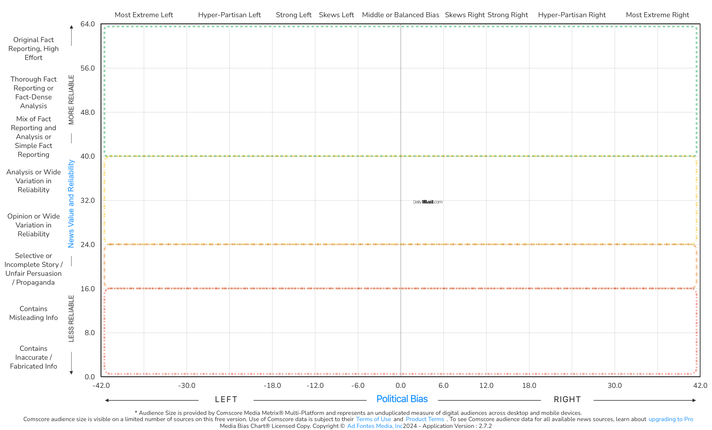
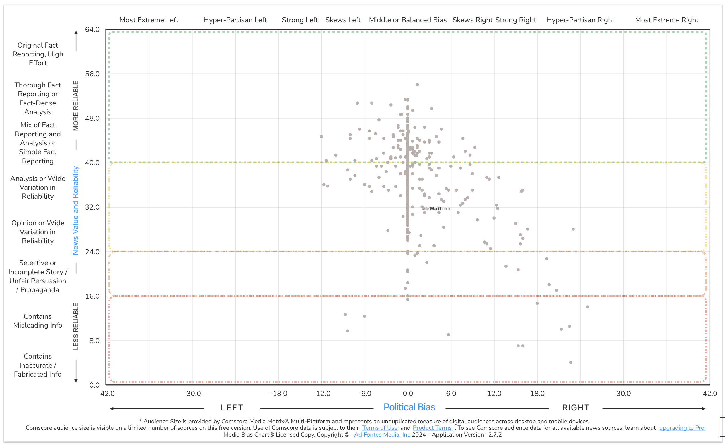
As an example, let’s take a closer look at The Daily Mail, a newspaper published in London. Our analyst team has rated hundreds of articles from The Daily Mail website and have given it an overall bias score of 3.85 (middle or balanced) and a reliability score of 31.66 (opinion or wide variation in reliability).
Each of the blue dots in the image below represents a piece of content our panels of human analysts have rated (more than 460 content pieces in all!). On the Interactive Media Bias Chart® on the website, you can click on these dots to see the actual article that was analyzed by our team.
As you can see, the content we’ve rated ranges from “skews left” to “hyper-partisan right” in terms of bias, although many of the articles fall directly in the center horizontally, indicating a “middle or balanced” bias.
When looking at reliability (the vertical axis), articles range from “thorough fact reporting or fact-dense analysis” near the top to “contains inaccurate/fabricated info” near the bottom. The weighted average of all of those scores puts The Daily Mail firmly between the opinion and analysis/wide variation in reliability sections of the chart. In this particular case, the Daily Mail is most accurately described as a source with wide variation in reliability, not as a source that is primarily opinion or analysis.
You can see from the scatterplot of articles that for the low-rated articles that have bias, most of them are to the right, and some very strongly so. Critics of the Daily Mail tend to remember these examples well, which is why most people who question our rating of the Daily Mail say it should be much lower and farther to the right.
Why the disparity between that perception and ratings? It’s important to remember that our methodology is based on content analysis over a representative sample. That means that our analysts read each article and rate it on its own merit, ignoring any opinions they may already have about the reputation of The Daily Mail. Each piece of content is rated by three analysts (one right leaning, one left leaning and one center) at the same time in order to mitigate any personal biases that might creep into the process. We apply the same sample selection methodology to each news source to try to gather a representative sample as objectively as possible.
So, our analysts read highly rated articles from The Daily Mail, like these: “Meet NASA’s new MOON rovers: Trio of miniature robots the size of a carry-on suitcase will create a 3D map of the lunar surface next year” and “Trump kisses the helmet of slain retired fire chief Corey Comperatore after he was shot and killed by gunman at his rally.” Both were rated as having “middle or balanced” bias and “mix of fact reporting and analysis or simple fact reporting.”
But they’ve also rated articles like this, “Congressman sensationally accuses Michael Cohen of cheating on his wife with ‘your girlfriends’, as ex-Trump attorney prepares to give blockbuster public testimony to Congress about POTUS,” which was rated as “skews left” and “contains misleading info,” and most recently, this one: “Biden, 81, sparks fresh health fears by staring blankly ahead as confident Kamala Harris takes lead while meeting Americans freed from Russian prisons,” which was rated as “hyper-partisan right” and “contains inaccurate/fabricated info.”
What we’ve learned is that one particular article or a TV show or podcast episode does not always accurately represent the website or show overall. For some sources, the content repeatedly falls in the same areas of the chart; for others, like The Daily Mail or The Joe Rogan Experience podcast, the bias and reliability of the content varies depending on the article or episode.
Want to compare more article and show ratings from a particular source? You can by using the Interactive Media Bias Chart® on the website. It’s free, but there are limits in terms of how many searches you can conduct per day and/or how much source data you can access. To get expanded access, you’ll need a News Nerd subscription. And to access ALL of it, you’ll need a News Nerd Pro subscription.
Want to stay informed on all of our work? Sign up for our free biweekly email newsletter!


