Fact or Opinion? Ethical News Outlets Make a Distinction
Author:
Beth Heldebrandt
Date:
07/01/2024
The reaction to last week’s presidential debate has been fast and furious. It’s certainly no surprise that media outlets with a liberal or conservative bias had a lot to say about the debate performances of President Joe Biden and former President Donald Trump.
But it’s not just the media on the left and right sides (indicating bias) of the Media Bias Chart® who had an opinion. News sources that fall near the middle of the chart (indicating a middle or balanced bias) and near the top (indicating more fact-based reporting) have also weighed in with their thoughts on the debate itself and whether the presidential candidates who participated in it are up for the job.
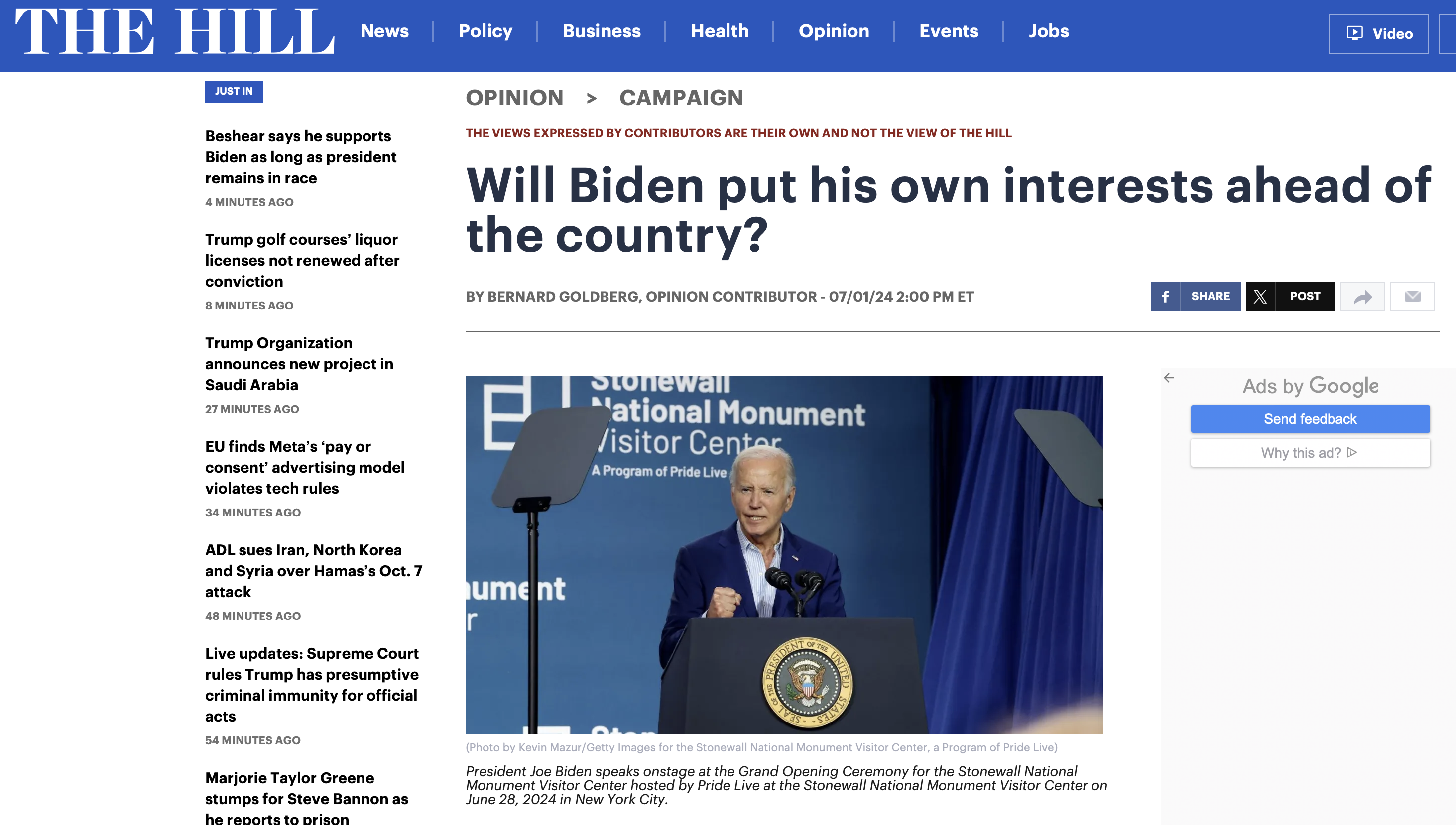
Take a look at this example from The Hill, a website with a -1.25 bias score (putting it in the “middle or balanced” category) and a 42.13 reliability score (“mix of fact reporting and analysis”):
It’s important to understand that ethical media outlets will make a distinction between their fact-based reporting and opinion content. This is done regularly online or in print. Editorials, columns and opinion pieces like this one from The Hill are labeled that way, so news consumers know that what they’re about to read goes beyond just the reported facts and into statements of meaning, conclusions, inferences, and predictions about reported facts.
However, news content doesn’t always fit neatly into a fact-reporting vs. opinion binary. More accurately, content sits on a continuum between fact-reporting, analysis, and opinion (the primary factor distinguishing the difference is density of facts in an article). Our analysts review both news stories and opinion content, as well as analysis content, and the weighted average of all of those ratings determines a source’s overall placement on the chart.
People who are familiar with the practice of labeling opinion content often ask us why we combine the fact-reporting and opinion content into one source score. There are three main reasons for that:
First, because most people attribute the content from the whole publication to the reliability and bias of the whole “brand,” or “masthead.” This is especially true nowadays, when content often shows up as a single article at a time in your social media feed. The most prominent identifier on a social media card is the name of the news source. Fact-reporting piece from CNN? It’s from CNN. Opinion piece from CNN? It’s from CNN.
Second, not all news sources label opinion (or analysis) content. Fact-reporting content is hardly ever labeled as such, so even for sources that label a section “opinion,” the rest is not labeled at all. Many popular sites, such as Reason and Vox, are mostly analysis but not labeled as such. Most cable news is analysis and opinion, but there is no point during the day when either MSNBC or Fox News announces something like “and now we switch to our opinion shows.”
Third, low-reliability and highly biased news sources will often label content as merely “opinion” to excuse content that is problematic, misleading, or even false, and it is important to distinguish between reasonably supported opinions and those based on underlying claims that are inaccurate.
Our analysts rate each article or episode on the content itself, and each piece of content is assigned scores for bias and reliability. These individual content scores can vary quite a bit for each source.
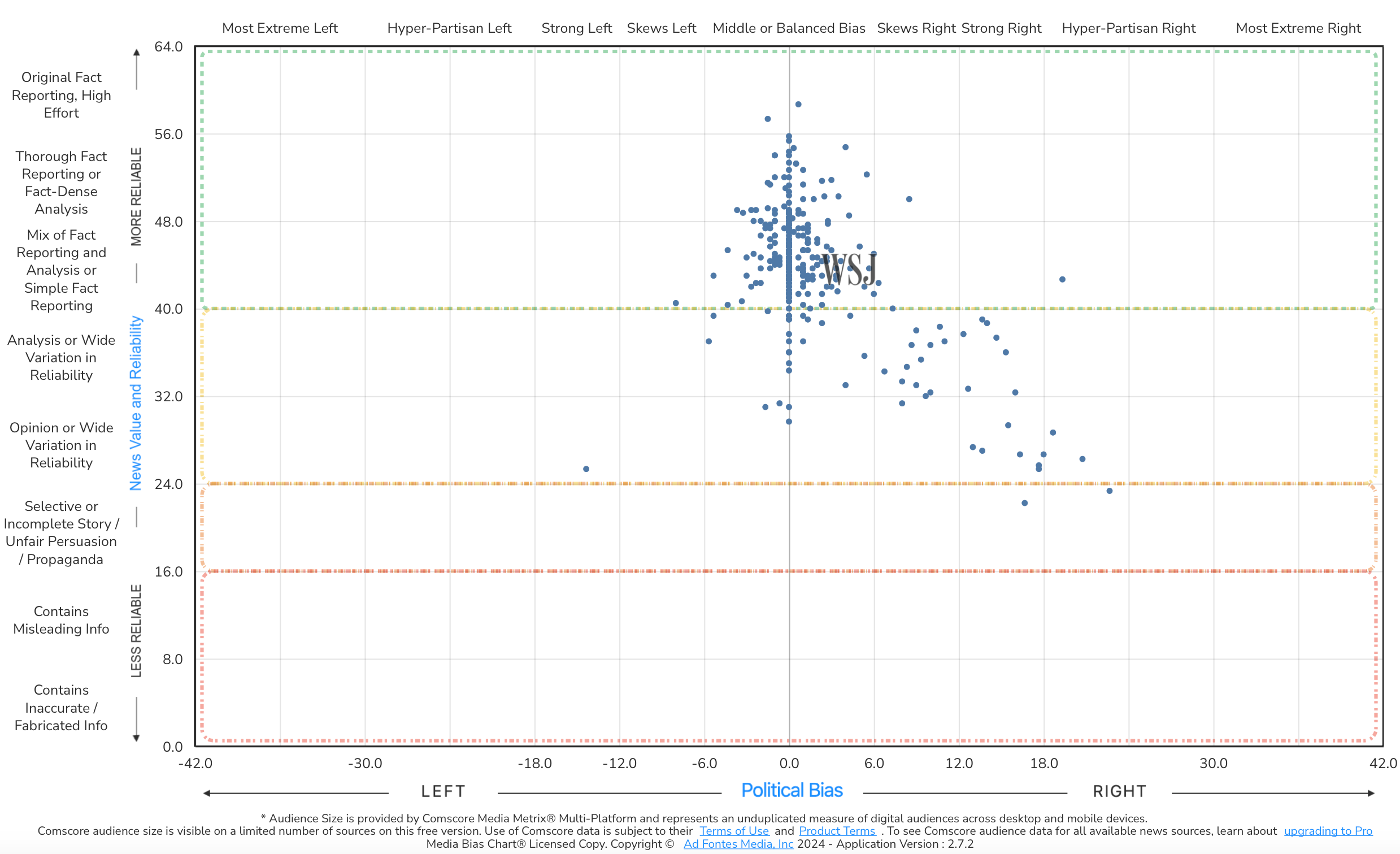
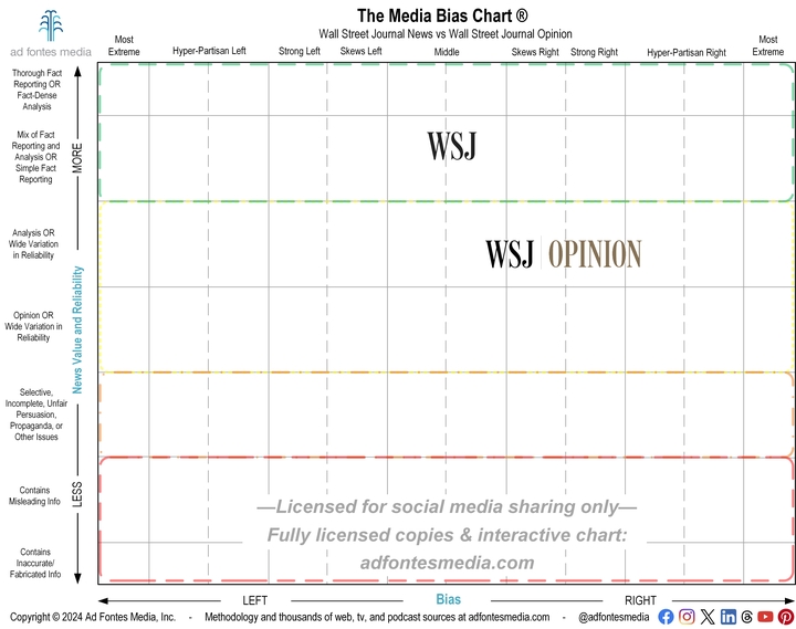
Let’s take a closer look at the Wall Street Journal, whose overall ratings put it slightly to the right of center in terms of bias and in the “mix of fact reporting and analysis” section for reliability (the actual scores are 4.23 for bias and 43.57 for reliability). Each of the blue dots in the image below represents a piece of content our panels of human analysts have rated (375 content pieces in all!). On the Interactive Media Bias Chart® on the website, you can click on these dots to see the actual article that was analyzed by our team.
Generally speaking, the dots near the top and middle of the chart represent news reporting by the WSJ. The dots lower on the chart and away from the center are generally opinion pieces. In fact, if you look at only news reporting by the WSJ, according to our content sample, it falls almost exactly in the center of the chart, indicating “middle or balanced” bias (the bias rating is .64; the reliability rating is 45). If you look at only opinion articles, however, it has moved nearly to the line between the “skews right” and “strong right” sections of bias and is firmly in the “analysis” section of reliability (the bias rating is 11.92; the reliability rating is 35).
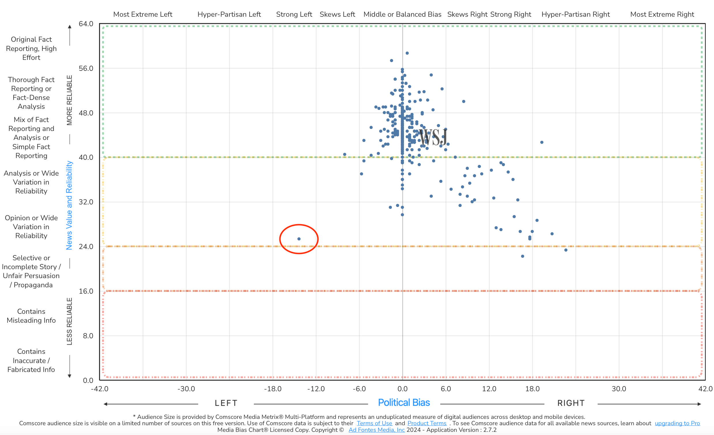
One piece of content seems out of place, though. What is that article in the lower left portion of the chart, indicating a “strong left” bias?
That’s a 2022 opinion piece written by President Joe Biden – an outlier compared to the typical content found on the WSJ Opinion page. Our analysts didn’t give this article a bias score on the right just because most content on the Opinion page falls there. Each piece of content is rated on its own merits according to our methodology.
Want to look at more fact vs. opinion comparisons on the chart? You can by using the Interactive Media Bias Chart® on the website or on the mobile app available for iPhone or Android. It’s free, but there are limits in terms of how many searches you can conduct per day and/or how much source data you can access. To get expanded access, you’ll need a News Nerd subscription. And to access ALL of it, you’ll need a News Nerd Pro subscription.
Want to stay informed on all of our work? Sign up for our free biweekly email newsletter!


