
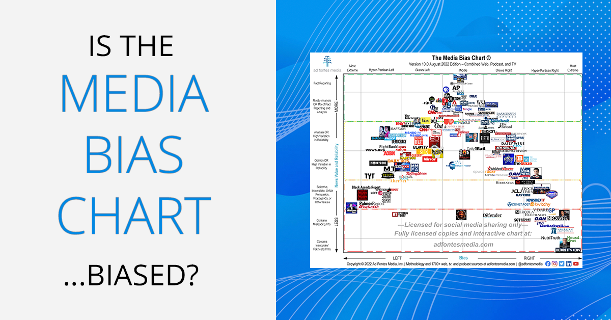
Is the Media Bias Chart…biased?
YES. Like all humans, and all organizations run by humans, Ad Fontes Media is biased. All the people who run it and work at Ad Fontes are biased. So are all the people who have viewed the Media Bias Chart and pointed out that it is, in fact, biased.
Can something that is created by biased humans still be useful and trustworthy?
YES, otherwise nothing would be useful or trustworthy. Things created by biased humans are just useful and trustworthy to different degrees.
Should you just take our word for it that the Media Bias Chart is useful and trustworthy?
NO. You should always evaluate usefulness and trustworthiness yourself using your reasoning. But here are some reasons you could choose to rely on the Media Bias Chart as a handy and quick guide to the media landscape.
Everything is biased
To be human is to be biased toward something or another–we all come into each situation with our own different thoughts, perspectives, and life experiences. One might say it is impossible to be “unbiased,” and we agree. That’s why the middle of the chart says “middle” and not “unbiased.”
But the fact that we individual humans each have some bias doesn’t mean that we can’t try to mitigate and reduce bias. Doing so is important in situations that demand some objectivity. Just because humans cannot be perfectly objective does not mean we should not try to be.
The word “bias” comes from Greek and French root words meaning “oblique line” or “slant,” which connotes a tendency to move toward one direction or another. Today, our common (and dictionary) definitions of bias include a reference to unfairness:
From Merriam Webster: “a tendency to believe that some people, ideas, etc., are better than others that usually results in treating some people unfairly”
“an inclination of temperament or outlook
especially : a personal and sometimes unreasoned judgment : PREJUDICE”
From Oxford Languages: “prejudice in favor of or against one thing, person, or group compared with another, usually in a way considered to be unfair.”
The way we use the term “bias” and the way commentators on our chart use it is really broad. But given the nature of most comments accusing us of bias, it appears the underlying concern is whether we are being unfair.
Bias isn’t always bad
On the Media Bias Chart, “opinion” content is lower on the scale than “fact reporting.” This is because the vertical axis on the chart measures something really specific, which is “news value and reliability.” We are measuring how much one can rely on a particular source for actual news–the “who, what, when, and where” as it relates to new information.
Because opinion is lower on the vertical scale, people ask us “does that mean you think opinions are bad?” No, that’s not what we are saying. Opinions aren’t bad. Opinions are important. Advocacy for positions, arguments to move in a particular direction–the very things that move society forward–are framed using opinions about moral issues. Opinions, and having opinions–is great. But opinions are not the same as news.
We classify opinions as less reliable than news because problems arise when people only consume opinions for their news. Problems also arise when people confuse opinion for news. The specific problems that arise are 1) susceptibility to misinformation and 2) extreme political polarization.
Consuming only opinion content for news is like consuming only donuts and fries for food. That’s why we can and do distinguish between things that are more like news and things that are more like opinion.
Even biases “left” and “right” aren’t necessarily bad.
People often (inaccurately) refer to the shape of sources plotted on the Media Bias Chart as a “bell curve.” But this chart isn’t a probability distribution curve showing the likelihood of events over a sample. We could arbitrarily change the order of either of the axes and it would change the overall shape of the group of news sources–for example, it could look like a “V” or an hourglass.
It also isn’t a graph of a function, where one variable always means something predetermined for the other variable.
Rather, the Media Bias Chart is a scatterplot showing two measures (reliability and bias) for any given news source which are not necessarily dependent on each other.
There is a strong but imperfect correlation between reliability and left-right bias on the Media Bias Chart due to the way we chose to lay out the axes. Often, the more left- or right-biased something is politically, the lower it is on the reliability scale, but not always. For example, look at all of these sources on the left with very similar left-bias scores but really different reliability scores. It’s not being left that makes something low-reliability; it is other factors:

And look at all of these sources on the right with very similar right-bias scores but really different reliability scores. One can advocate for a political position in more or less reliable ways:

Middle doesn’t mean “reliable” either! There are sites on the chart that aren’t consistently biased to one political side or the other, but they are consistently not very reliable:

Bias can be mitigated
There are many situations that require humans to try to mitigate bias, such as refereeing sports and reporting the news.
Individual people have their favorite sports teams toward which they are sometimes extremely biased, but referees who love one sports team are still expected to mitigate their bias when they are refereeing.
Individual citizens have their preferred political views toward which they are sometimes extremely biased, but reporters with political views are still expected to mitigate their bias when reporting news.
Lots of other positions in society carry expectations that the people in those roles operate with maximum fairness, even though they are imperfect and biased humans. Judges and juries in court, teachers grading tests, and officials conducting elections all need to operate with maximum fairness. In all of these cases, people can implement practices and controls to minimize bias. These include 1) acknowledging one’s own biases, 2) actively trying to be fair 3) using repeatable standards and metrics and 4) allowing accountability by having others observe.
What Ad Fontes Media does–rating the news for reliability and bias–is another situation where people should expect maximum fairness. Therefore, we implement the practices listed above to mitigate and minimize our own bias.
What are our biases and how do we mitigate them?
Ad Fontes Media is a privately held Public Benefit Corporation with a founder/CEO, a full-time staff of five, a part-time staff of six, and a set of about 35 paid contract analysts. We have a lot of different stakeholders, from customers to investors, all with different political beliefs. You can read about how we balance their various interests in our Stakeholder’s Statement.
Our founder, Vanessa Otero, has left-of-center political views. Is that a reason to discredit the work Ad Fontes Media does, especially if you don’t share left-of-center political views? Maybe. But a company has to be started by someone, and that someone is always going to have some political views. Would it be better if our founder was a centrist, or had right-of center political views? Even centrism is a type of bias.
And being politically “moderate” is no guarantee of moral correctness anyway. Sometimes views that are considered radical in one era end up becoming the dominant moral views in later eras. Abolitionists and American Revolutionists alike were once considered radicals. Ultimately, each of us believes our own political views are the morally “correct” ones, so we are each prone to believe that someone who shares the same political views as us would be the best kind of person to do this work.
A fundamental step toward mitigating bias is recognizing that no one person is always correct all the time, and that we can get fuller pictures of objective truth (to the extent it exists) by incorporating multiple perspectives. This is why the most important part of our methodology is that we have a politically and demographically diverse group of analysts. Each article and episode we rate is rated by three analysts–one right, one left, and one center. You can see a video of our analysts in action and read extensively about our methodology here.
What qualifies us to do this work anyway?
There is nothing extraordinary, in terms of degrees and qualifications, of the people who work at Ad Fontes Media. Yes, most of our analysts have advanced degrees, including several Ph.Ds and JDs, and everyone has strong reading comprehension skills and political knowledge. But as you can see on our site, we regularly take applications for new analysts. We provide training on our methodology. We believe that as long as people have a strong baseline level of reading comprehension and political knowledge, anyone can learn to rate news sources as well as we do.
What qualifies us, then, is the work we have done and continue to do every day to actually sit down together and read and watch and rate the news. We do this in shifts on Zoom for three hours at a time, all day, every day. We’ve rated over 27,000 articles and episodes (each with three people at a time) to date. As a group, we’ve laid eyes on the nearly 1500 news sources we’ve rated–many hours for each. If you did the same thing, you’d come up with similar ratings, plus or minus just a few points in each direction.
Whose “truth” does this chart reflect?
Philosophers have debated the existence of an objective truth for centuries, and we won’t resolve that here. But on the relationship between the Media Bias Chart and “the truth” of how reliable and biased the media sources on it are, we’ll say this: The Media Bias Chart does not reflect any one person’s view. Not the view of any one analyst, not the view of our founder, and not your view. Literally everyone disagrees with the Media Bias Chart in one way or another.
This is because each of us not only brings our own bias, but our own limited sample of news stories we have individually read, which is necessarily fewer than the sample of news stories scored on the Media Bias Chart.
The view shown on this chart is a composite view of over 40 diverse Americans who are reasonably skilled and trained to evaluate news sources. It’s not any one person’s truth. It’s no one’s truth. But perhaps that’s the closest we can get to a shared truth.
Check out our Interactive Media Bias Chart.

Vanessa Otero
Vanessa is a former patent attorney in the Denver, Colorado area with a B.A. in English from UCLA and a J.D. from the University of Denver. She is the original creator of the Media Bias Chart (October 2016), and founded Ad Fontes Media in February of 2018 to fulfill the need revealed by the popularity of the chart — the need for a map to help people navigate the complex media landscape, and for comprehensive content analysis of media sources themselves. Vanessa regularly speaks on the topic of media bias and polarization to a variety of audiences.
