New Media Bias Chart for TV/Video Features Our Lowest Rated Video Show Ever and Our First Rated Documentary
Author:
Vanessa Otero
Date:
10/29/2024
Ad Fontes Media has released its October Media Bias Chart® for TV/video sources, and there are a couple of new notable sources on this edition!
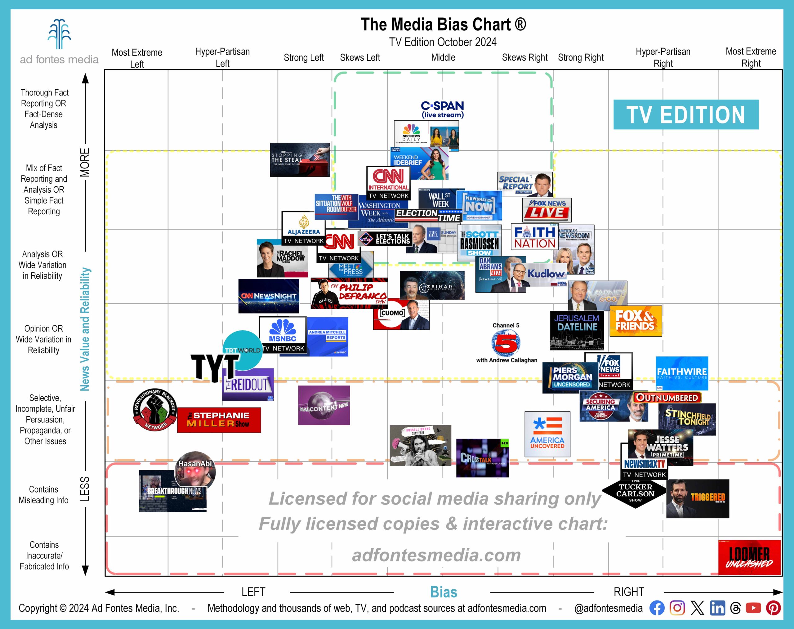
Upon request, we have started rating political documentaries, with the first one being HBO’s Stopping the Steal. It has a very high reliability rating and a strong left bias rating, which illustrates some key distinctions about our taxonomy and methodology:
Something can be very factual but still have a fairly strong bias to the left or right. How? Remember, not all forms of bias are “bad.”
“Bias” is a broad term that includes more benign concepts like favoring, focusing on, or being predisposed to agreeing with a side. Think of it in the sports context, where being biased toward your team can mean cheering for and focusing on things that are positive, like wearing your jersey and praising your players.
But “bias” also includes more malignant concepts such as prejudice, unfairness, antipathy, and malice. In the sports context, bias can easily cross over into seeing referee calls wrongly or fighting with your opponent and calling them names.
In the media landscape, the malignant forms of bias have a high correlation with low reliability. But high-reliability sources can have left or right biases that don’t detract from their reliability.
In the case of HBO’s Stopping the Steal, it received a high reliability rating from our analysts because it was full of well-sourced, in-depth fact reporting, mostly through interviews from witnesses to the events of the 2020 election and aftermath. Most of these witnesses were/are actually Republicans, conservatives, and/or Trump supporters.
It received a strong left bias rating for two main reasons. The first reason was topic selection. It’s always a choice of what to cover in any story, including a documentary. Focusing on the factual events of the efforts to overturn the election are inherently of more interest and appeal to Democrats, liberals, and/or Trump opponents, and inherently portray the perpetrators of those events (Republicans, conservatives, and/or Trump supporters) in a persistent negative light.
The second reason was the imagery and music used in the documentary, which enhanced the negative portrayal.
Reporting on a negative action isn’t necessarily biased — after all, some facts are just negative and the most straightforward report on those facts shouldn’t automatically be classified as biased. But extended focus on one negative thing necessarily excludes coverage of other positive things, especially in a documentary format, and it can give viewers a sense of topic selection bias.
It’s the same for positive coverage; imagine someone made a fully factual documentary that was solely about Trump’s business successes. There would be a strong right bias because it focuses on that and does not include his business failures or other negative things he has done.
We plan on rating more political documentaries in the coming months. Remember, we rate “news and news-like information sources.” Specifically, we rate their content for reliability and bias.
That means we can and do rate a lot of “content” that isn’t news, but which people rely on for political information, and that easily includes documentaries. Heck, they are shorter than some of the podcasts we rate (I’m looking at you, Joe Rogan).
Speaking of political content that isn’t news, we have a newly rated entry on the chart that has the distinction of being the lowest rated and farthest right video show on the chart. It’s Laura Loomer’s show on Rumble. If you’re not familiar with her, here’s a recent BBC article with a good summary of her past and current, um, controversies.
Related, remember this election season that our elected officials aren’t necessarily any better than ordinary citizens at determining what media information is reliable. They are humans with all the biases, flawed logic, and competing incentives that other humans have.
Determining reliability and bias is a skill you can develop, and we’re here to help you continue developing that skill. Without further ado, here’s what’s new on this edition!
October’s TV/video chart features 55 of the more than 640 TV/video programs our team has fully rated. A list of the 55 sources included on the TV/video static chart this month is on our website. In order to make the logos as large and readable as possible, we have magnified a portion of the chart and removed portions around the edges that contain no sources.
Eight shows appear on the chart for the first time:
- Channel 5 with Andrew Callaghan (YouTube)
- HBO: Stopping The Steal
- Laura Loomer (Rumble)
- NewsNation: NewsNation Now Weekend with Adrienne Bankert
- Real America’s Voice: Stinchfield Tonight
- Scripps News: Weekend Debrief
- The Philip DeFranco Show (YouTube)
- TRT World (YouTube)
Don’t see your favorite show on the October chart? That doesn’t mean we haven’t rated it! It’s impossible to show the logos of 640 different programs in one image — they overlap each other and the result is a completely unreadable chart. That’s why we choose a sample to feature each month.
If you want to check our ratings on more TV/video sources, you can access a selection of them for free on the Interactive Media Bias Chart® on our website. Or, you can search all sources we’ve rated on the free Media Bias Chart app, available for iPhone and Android. Daily search limits apply.
When you add in our web/print and podcast/audio ratings, our analysts have fully rated about 4,000 sources, with commercial data on over 11,100 sources. Become a subscriber to have additional access to our data!
Want to stay informed on all of our work? Sign up for our free biweekly email newsletter!
Vanessa Otero is a former patent attorney in the Denver, Colorado, area with a B.A. in English from UCLA and a J.D. from the University of Denver. She is the original creator of the Media Bias Chart (October 2016), and founded Ad Fontes Media in February of 2018 to fulfill the need revealed by the popularity of the chart — the need for a map to help people navigate the complex media landscape, and for comprehensive content analysis of media sources themselves. Vanessa regularly speaks on the topic of media bias and polarization to a variety of audiences.


