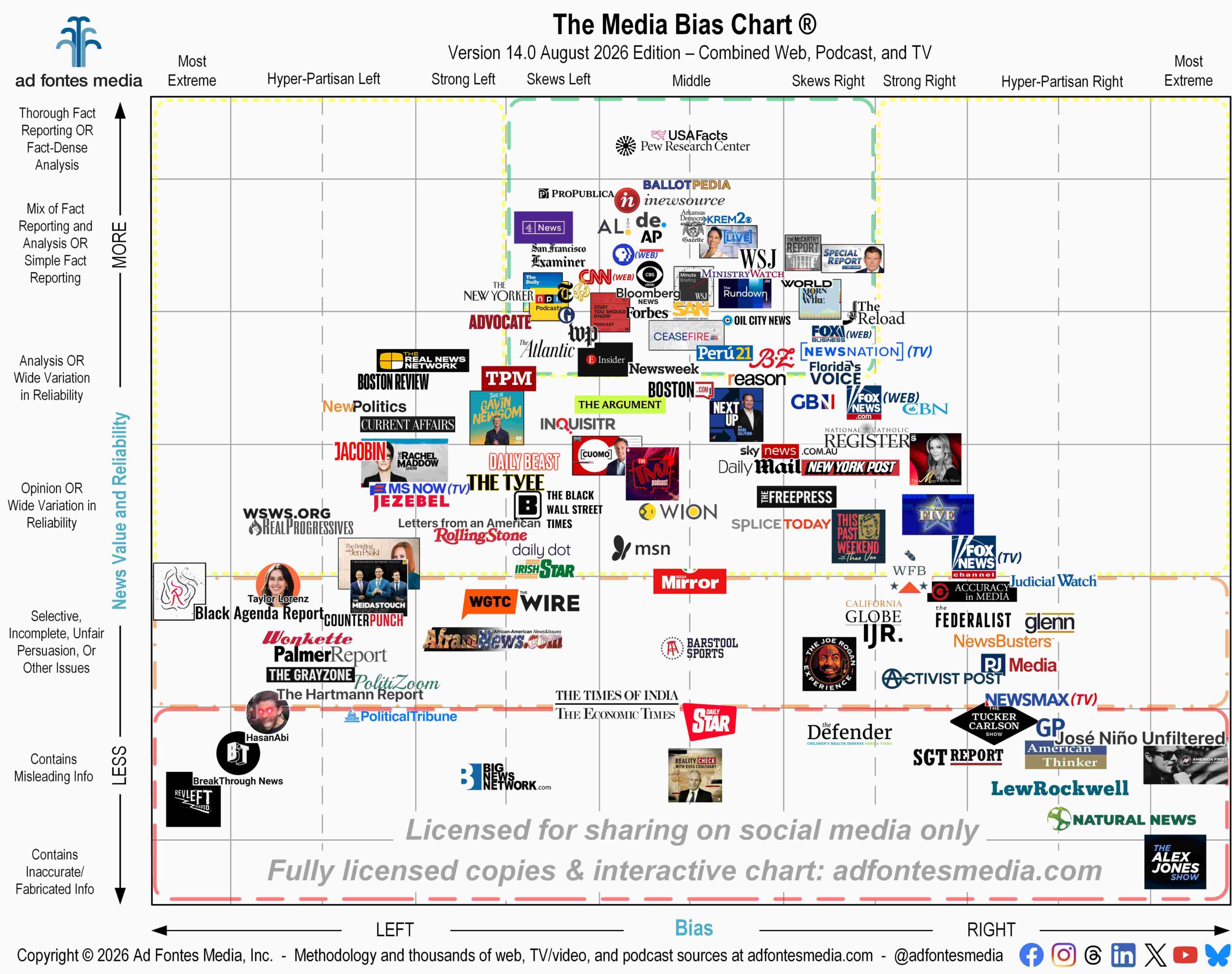
I’ve now been involved in the work of media research for a decade, and I’m so grateful to all of you who have supported the work of Ad Fontes Media. I created the first Media Bias Chart® on a whim prior to the 2016 presidential election — just to share with my family and friends — and the success of that chart has evolved into the media research and ad tech company you see today.
My original goal was to provide a resource for everyone — anyone — to check the bias and reliability of various media and information sources that they encounter. To make that as simple as possible, we created first an Interactive Media Bias Chart® and then a free mobile app for both Android or Apple. As we’ve grown our data in both size and dimensions, we’ve always tried to provide more value for free users and paid users alike.
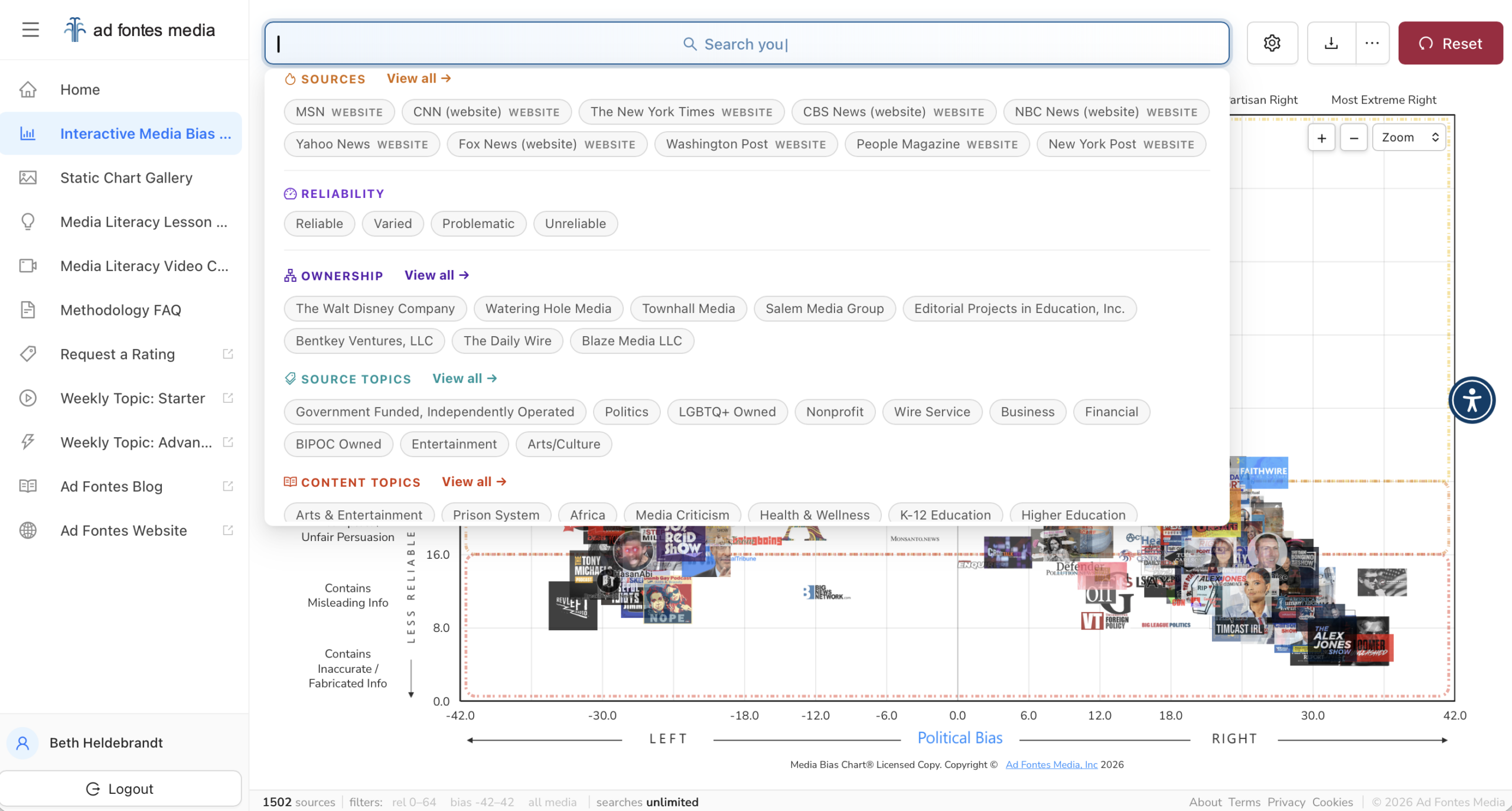
Thousands of you use our interactive chart on the website each week, and over time we’ve learned a lot about how you use it and what features you’d like to see added. Our team has been hard at work designing a new version of the interactive chart with a TON of cool, new features, and we’re excited to make it available now!
First, you’ll notice that the search box is now above the chart rather than on the left. This newly designed search box gives you lots of new options to filter our data:
- Search sources by geographic location: Create a custom chart that shows sources in your state, region or city!
- Filter sources by ownership: Find out where all Fox Corporation, Warner Bros. Discovery, Nexstar (or any other media company) sources fall on the chart.
- Search for news by topic, both at the source level and the content level. That means you can search for sources that report on politics or business, or look up articles, podcasts or videos our team has rated about a particular subject, such as Iran or artificial intelligence.
Previously, nonsubscribers using the free interactive chart could search for only 250 of the thousands of sources we’ve rated. This was frustrating for people who were checking out the IMBC for the first time and couldn’t find the source they were looking for, but it was the best method under our previous architecture we could design to keep our data secure (there are people out there who try to scrape it all, unfortunately).
Now, any user can see placements of any of the 4,760 we have available (with more added every week)! But still, for data-protection purposes, non-logged-in users will be limited to five searches of our data all-time.
But we have a new option: Free with Login. When you create a free login using your email address, you’ll be able to conduct 10 searches per month (instead of five searches all-time). This account level also opens up additional functionality across the IMBC.
Our paid subscribers have even more data access, with the ability to conduct additional searches on the chart every day, month and year. They also can see how a particular source’s bias and reliability scores have changed over time. Subscribers also get access to other features appropriate to our various Individual, Educator, and Business plans, like additional content rating requests, media literacy lesson plans, and an invitation to special programs such as our ongoing Navigating the News with Vanessa webinar series. These extra benefits are available with subscriptions starting at $5 a month.
I hope you enjoy the new search functions on our Interactive Media Bias Chart®. It’s another step toward our mission, which is to rate all the news to positively transform society. We want to help bring people together — not an easy task in today’s polarizing political environment — and we believe that helping people find fact-based and fair information about the news is a vital first step.
We’d love to hear what you think about the new IMBC. Email us with your feedback!

Vanessa Otero is a former patent attorney in the Denver, Colorado, area with a B.A. in English from UCLA and a J.D. from the University of Denver. She is the original creator of the Media Bias Chart (October 2016), and founded Ad Fontes Media in February of 2018 to fulfill the need revealed by the popularity of the chart — the need for a map to help people navigate the complex media landscape, and for comprehensive content analysis of media sources themselves. Vanessa regularly speaks on the topic of media bias and polarization to a variety of audiences.