
Since the presidential inauguration last month, there’s been a daily barrage of “breaking news” about government, politics, natural disasters, sports and more. It can feel overwhelming at times, but it’s important to keep informed, and it’s vital that you get that information from a reliable source.
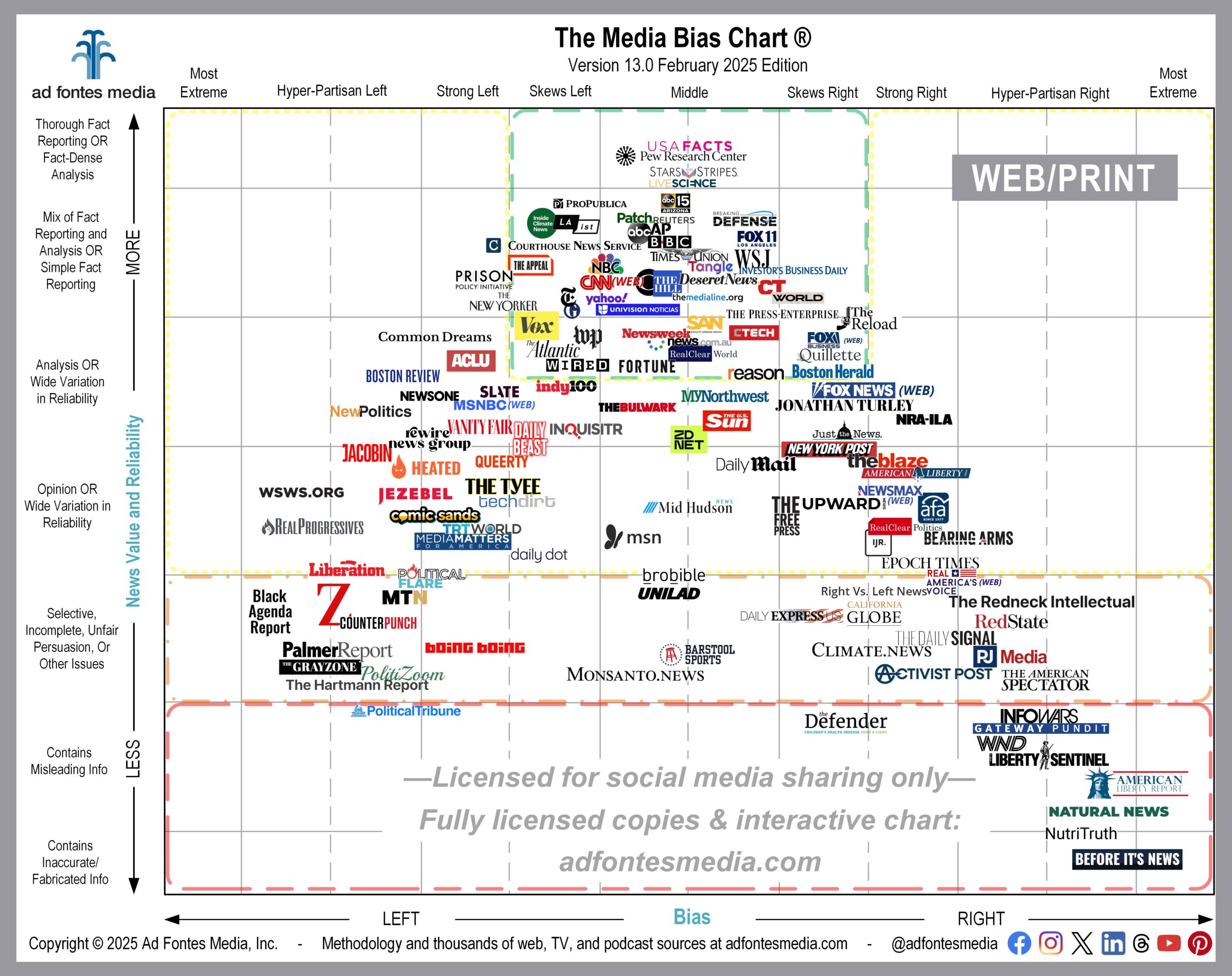
Today we’re releasing the February version of the Web/Print Media Bias Chart®, which includes 132 of the more than 2,600 websites our analyst team has rated. This chart features the websites of local, national and international news outlets (watch for our charts featuring podcast and TV/video sources later this month).
The chart is divided into different colored sections, and as we explained last month, the sources in the green box (top middle) of the chart are recommended by our team to provide minimally biased and reliable, fact-based information.
Here’s a list of all sources that fall within the green box on this chart. Remember: This is a sample of the 2,600 online sources we’ve rated. More websites fall within the green box, and we’ll feature those on charts in the future.
- ABC News (website)
- ABC15 Arizona KNXV
- AP
- BBC
- Boston Herald
- Breaking Defense
- CBS News (website)
- Christianity Today
- CNN (website)
- Courthouse News Service
- CTech
- Deseret News
- Fortune
- FOX 11 LA KTTV
- Fox Business (website)
- Inside Climate News
- Investor’s Business Daily
- LAist
- Live Science
- NBC News (website)
- news.com.au
- Newsweek
- Patch
- Pew Research Center
- ProPublica
- Quillette
- RealClearWorld
- Reason
- Reuters
- Stars and Stripes
- Straight Arrow News
- Tangle
- The Appeal
- The Atlantic
- The Guardian
- The Hill
- The Media Line
- The New York Times
- The Press-Enterprise | Riverside County
- The Reload
- Times Union
- Univision News
- USAFacts
- Vox
- Wall Street Journal
- Washington Post
- WIRED
- World News Group
- Yahoo News
If you’d like to see a list of all 132 sources included on the February web/print chart, you can find it on our website. Remember, we choose a selection of sources to include on each month’s chart because it’s impossible to put all of them in a single image.
Can you imagine a chart with 2,600 sources on it? The logos would overlap, and the result would be an image that is impossible to read. In order to make the logos as large and readable as possible, we have magnified a portion of the chart and removed portions around the edges that contain no sources.
Six sources make their debut on this month’s chart:
- BroBible
- indy100
- Jonathan Turley
- Rewire News Group
- The Redneck Intellectual
- Times Union
Don’t see your favorite source on the February chart? You can look up ratings on all sources we’ve analyzed and create custom chart images using our free mobile app available for Apple and Android. You also can access the free version of the interactive chart on the website, which allows access to data on 250 of our top sources. Daily search limits apply.
For expanded access, please consider a News Nerd subscription, which gives you the ability to search all sources we’ve rated and provides many additional benefits.
To keep up on all of our work, please join our email list.
 Beth Heldebrandt is a Media Research Specialist at Ad Fontes Media. She has more than 30 years of experience in the fields of journalism and public relations, and was an adjunct instructor of journalism for 17 years at Eastern Illinois University. Beth has a B.A. in journalism from Southern Illinois University-Carbondale and an M.A. in English from Eastern Illinois University. She’s a mom and grandma, and enjoys traveling, puzzles and reading.
