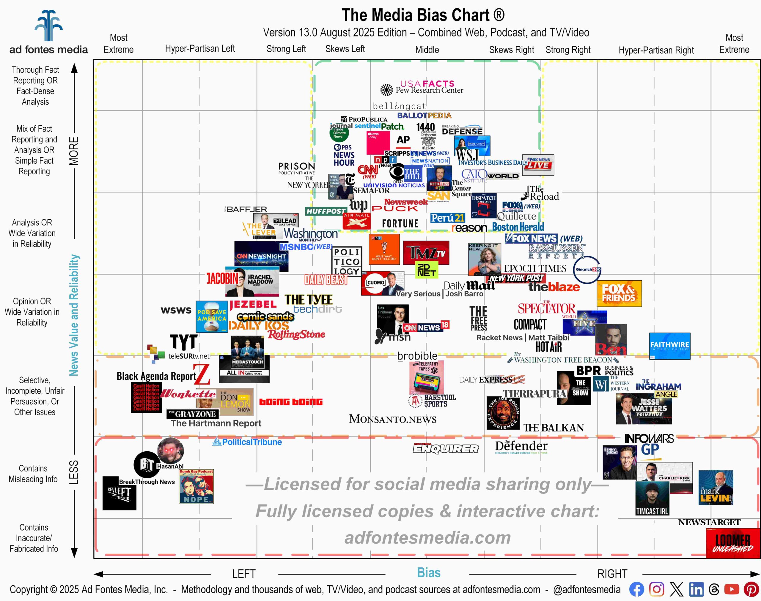
A recent article from the Poynter Institute questioned the placement of some sources on our recently released flagship Media Bias Chart®. Specifically, the author asks why the New York Times would be positioned to the left of “TrueAnon,” a conspiracy podcast, or why “The Joe Rogan Experience” podcast would be more “centrist” than The Wall Street Journal, and “Under the Skin With Russell Brand” closer to “unbiased” than The Washington Post.
The author’s critique reflects a misunderstanding of what it means when a source is located in the center of the chart on the horizontal axis, known as bias, and its correlation to the vertical axis, known as reliability. Let me explain.
On the Media Bias Chart, sources on the far left side of the chart have been rated to have a “most extreme left” bias (based on the U.S. political spectrum), while sources on the far right side of the chart have been rated to have a “most extreme right” political bias. As you move closer to the middle point of the bias axis, sources are indicated to have increasingly less *specifically left or right* political bias, according to our analysts’ ratings.
So does that mean that sources in the middle of the chart are “unbiased” or “centrist,” as suggested in the Poynter article? Not necessarily. Sources in the center of the chart do have biases (we all do), and they can end up in the horizontal center of the chart for a variety of reasons.
For example, our analysts may have found little to no political bias in a source’s coverage overall, placing the source near the middle, which is common with sources that cover primarily apolitical topics. It could have been that our analysts found both liberal and conservative points of view were represented in various articles or episodes of a source. In those cases the average scores of all of that source articles combined, then, puts it in the middle range.
For these reasons our chart uses specific language for sources in the horizontal middle of the chart, designating them as “middle or balanced bias,” not “unbiased” or “centrist.”
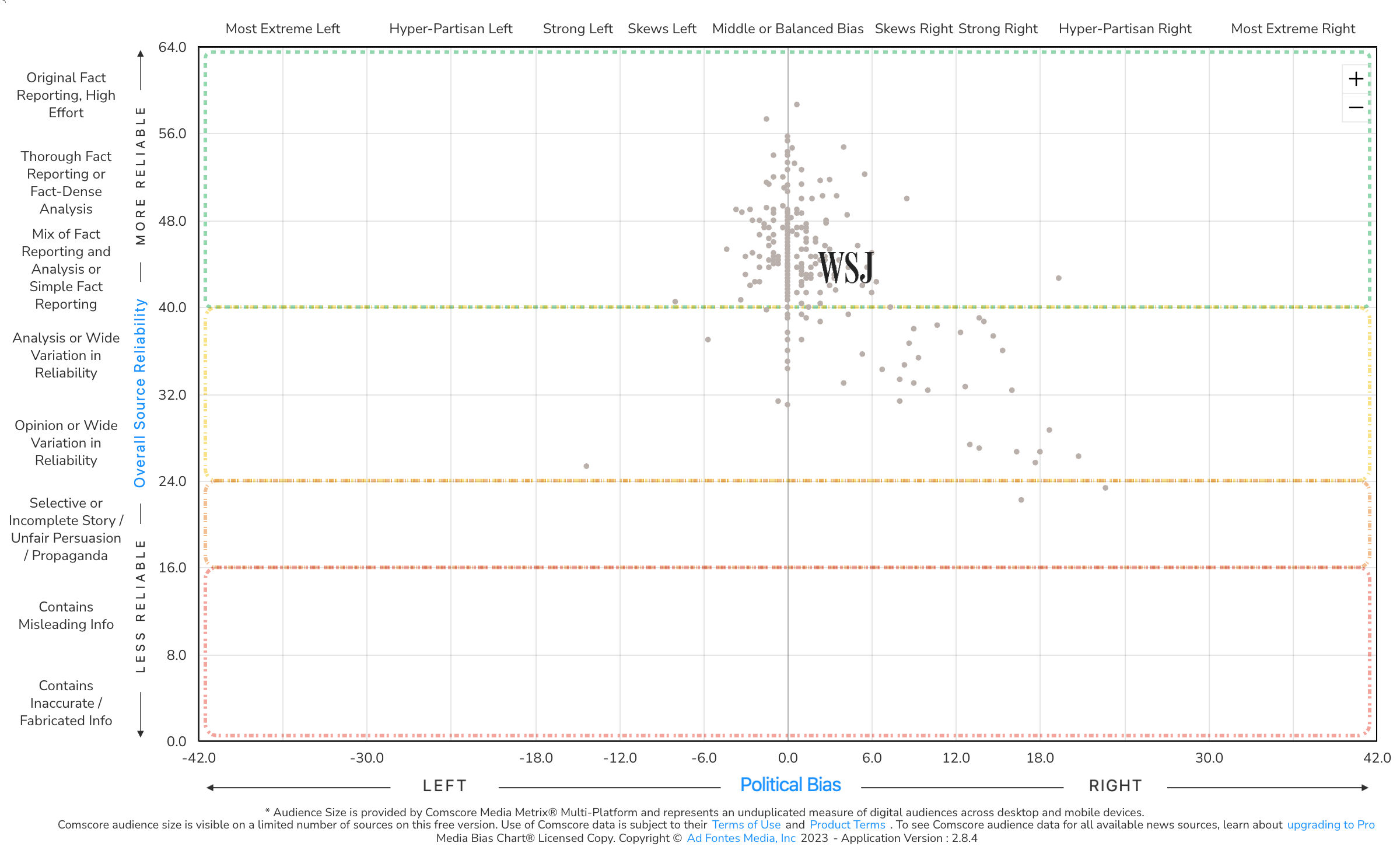
As the Poynter article noted, “The Joe Rogan Experience” is found closer to the middle of the chart than the Wall Street Journal. While our analysts detected little bias in most of the WSJ articles that were rated, several were found to have a strong or hyper-partisan right bias, which moved the overall bias score for the source to the right of center. (Each dot in the image below represents an article from the WSJ that was rated by our analyst team).
Our analysts found several episodes of “The Joe Rogan Experience” with a strong or hyper-partisan right bias, as well. But the podcast also has episodes with strong and hyper-partisan left bias. The average bias score for the podcast, then, puts it near the center – even slightly closer to the center than the WSJ. (Learn more about “The Joe Rogan Experience” and its placement on our chart in this video.)
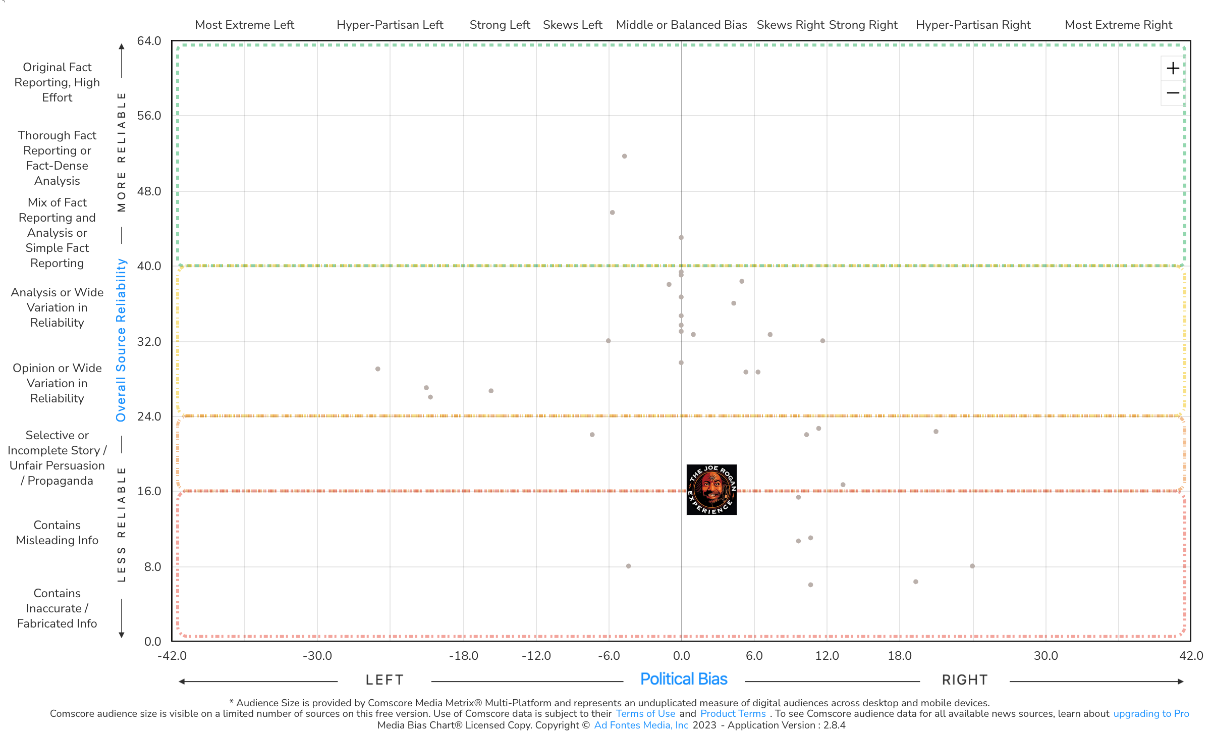
But although the Wall Street Journal appears slightly farther right on the chart, it also rates much, much higher on the reliability (vertical axis) score than the Rogan podcast, making it a more reliable source of information overall. “Middle” does not mean “reliable.”
Another example in the Poytner article is related to “TrueAnon.” This podcast was born as a result of conspiracy theories surrounding Jeffrey Epstein, and the Poynter author refers to it as a “Marxist podcast.” While the podcast’s Wikipedia page does state that two of its hosts identify as Marxists, the podcast itself is not hyper-partisan left in bias. It is a mix of comedy, true crime, and loose political commentary. Our methodology of content analysis examines all content, not just the backgrounds, views and opinions of the hosts.
The Poynter article states that reliability and bias are nuanced and complex, implying that our ratings are not. But the opposite is true. Our methodology rates content granularly at the article level to capture as much nuance and complexity as possible.
Our mission is to rate all the news and make a positive impact on society. That is no small task due to the complexity of the work. This is why we believe in transparency and openly share our methodology and training process. Of all the frameworks available to us, why content analysis?
Content analysis is a systematic analysis of content, providing a structure that can help organize and make sense of data from across a variety of different mediums. Analysts bring with them different points of view and political ideologies. Content analysis helps minimize subjectiveness and maximize replication.
Is it a perfect system? No. There are no methodologies that can boast that claim. However, content analysis gets us closer. It is a structured approach that gives us the opportunity to take a deeper look into the quantitative and qualitative aspects of any text, combining the visual and textual elements, making it a valuable tool in understanding a complex media landscape.
We do not shy away from complexity at Ad Fontes, and are very familiar with critiques of our work. That is why we appreciate the opportunity to respond to a recent one of the Media Bias Chart and explain any misunderstandings.
 Vanessa Otero is a former patent attorney in the Denver, Colorado, area with a B.A. in English from UCLA and a J.D. from the University of Denver. She is the original creator of the Media Bias Chart (October 2016), and founded Ad Fontes Media in February of 2018 to fulfill the need revealed by the popularity of the chart — the need for a map to help people navigate the complex media landscape, and for comprehensive content analysis of media sources themselves. Vanessa regularly speaks on the topic of media bias and polarization to a variety of audiences.