10 ‘Recommended’ Podcasts Featured on December Media Bias Chart
Author:
Beth Heldebrandt
Date:
12/16/2024
Ad Fontes Media’s methodology is based on the concept that fact reporting is the cornerstone of good journalism. Verified facts are necessary for the public to be informed, and we can’t form our own opinions about the news without having the facts first.
For that reason, fact-based sources of information, as determined via our analysis, are placed near the top of the Media Bias Chart®. Content that includes facts with analysis falls below that, then opinion content, then selective or incomplete/unfair persuasion, with misleading and false information placed at the bottom.
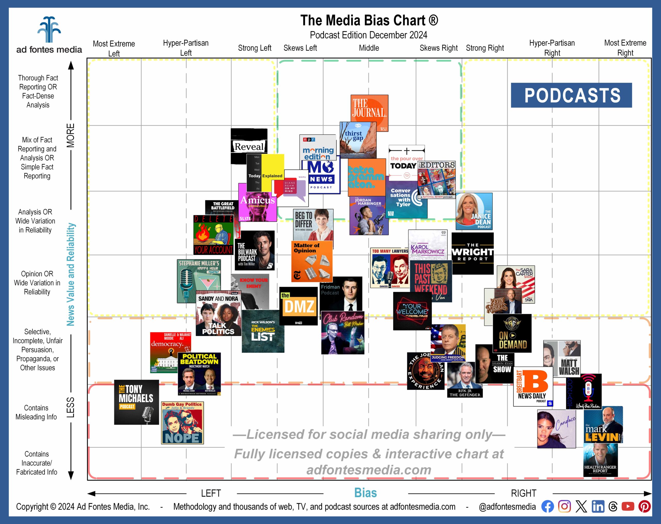
To make these distinctions easy to understand at a glance, the Media Bias Chart® is divided into different colored sections. Sources in the green section of the chart are ones we actively recommend — to news consumers, advertisers, and everyone — to provide reliable and minimally biased or balanced information, while sources in the orange and red section are ones we actively do not recommend as reliable information sources.
Sources in the yellow section are ones where we recommend caution and additional inspection. They can be in this section for several reasons: if they are below 36, they may contain more analysis and opinion than facts, or they may vary widely in reliability.
Sources may have high levels of bias even if they have high reliability scores. For example, there are some sources that score greater than +/-12 for bias, but also score above 40 for reliability. Though these are reliable, we put them in the yellow zone to make observers aware that they focus quite strongly on one side.
Previously, our green box included all sources with a reliability score of at least 40, regardless of their bias rating. But we’ve realized over time that balanced, fact-based analysis is good journalism, too. Analysis is often necessary to help us understand the background, historical relevance and importance of the day’s news.
So, we’ve adjusted the green and yellow boxes on the chart. You’ll see that the green section now includes sources with a reliability score of 36 and above, to include strong fact-based analysis.
In addition, sources in the green box are now limited to those that fall within the “skews left,” “middle/balanced” and “skews right” bias categories. Sources with bias ratings farther to the left or right — even if they are fact-based or strong analysis — now fall within the yellow box.
As always, our ratings are intended to serve as a guide to the media landscape. Most sources on the chart now fall within the yellow section, but that doesn’t necessarily mean you should avoid them. Just be aware that information from those sources might be biased or include opinion rather than straight facts. Use your own judgment when choosing your sources of information!
You’ll find 10 sources within the green “recommended” box on the December edition of the Podcast/Audio Media Bias Chart® released today, including two that are featured on the chart for the first time:
- WSJ: The Journal.
- NPR: Morning Edition
- Tetragrammaton with Rick Rubin
- Mo News Podcast
- The Pour Over Today
- The Editors
- Diane Rehm: On My Mind
- The Jordan Harbinger Show
- Conversations with Tyler – new!
- Thirst Gap: Learning to live with less on the Colorado River – new!
In all, this chart displays 48 of the more than 760 podcasts our team has rated (that’s more than 3,000 episodes!). We choose a selection of podcasts to include on each month’s static media bias chart because it’s impossible to show all of them in one image (see the list of all 48 shows on the December chart here). In order to make the logos as large and readable as possible, we have magnified a portion of the chart and removed portions around the edges that contain no sources.
In addition to Thirst Gap and Conversations with Tyler, four other podcasts are included on the chart this month for the first time:
- Delete Your Account Podcast
- Beg to Differ with Mona Charen
- Armstrong & Getty On Demand
- Shawn Ryan Show
If your favorite podcasts aren’t on the December chart, you can still search for them using the Interactive Media Bias Chart® on our website, as well as our Media Bias Chart® app, available for iPhone and Android. Daily search limits apply.
When you add in our web/print and TV/video ratings, our analysts have fully rated about 4,000 sources, with commercial data on over 11,200 sources. Become a subscriber today to have additional access to our data set!
Want to stay informed on all of our work? Sign up for our free biweekly email newsletter!


