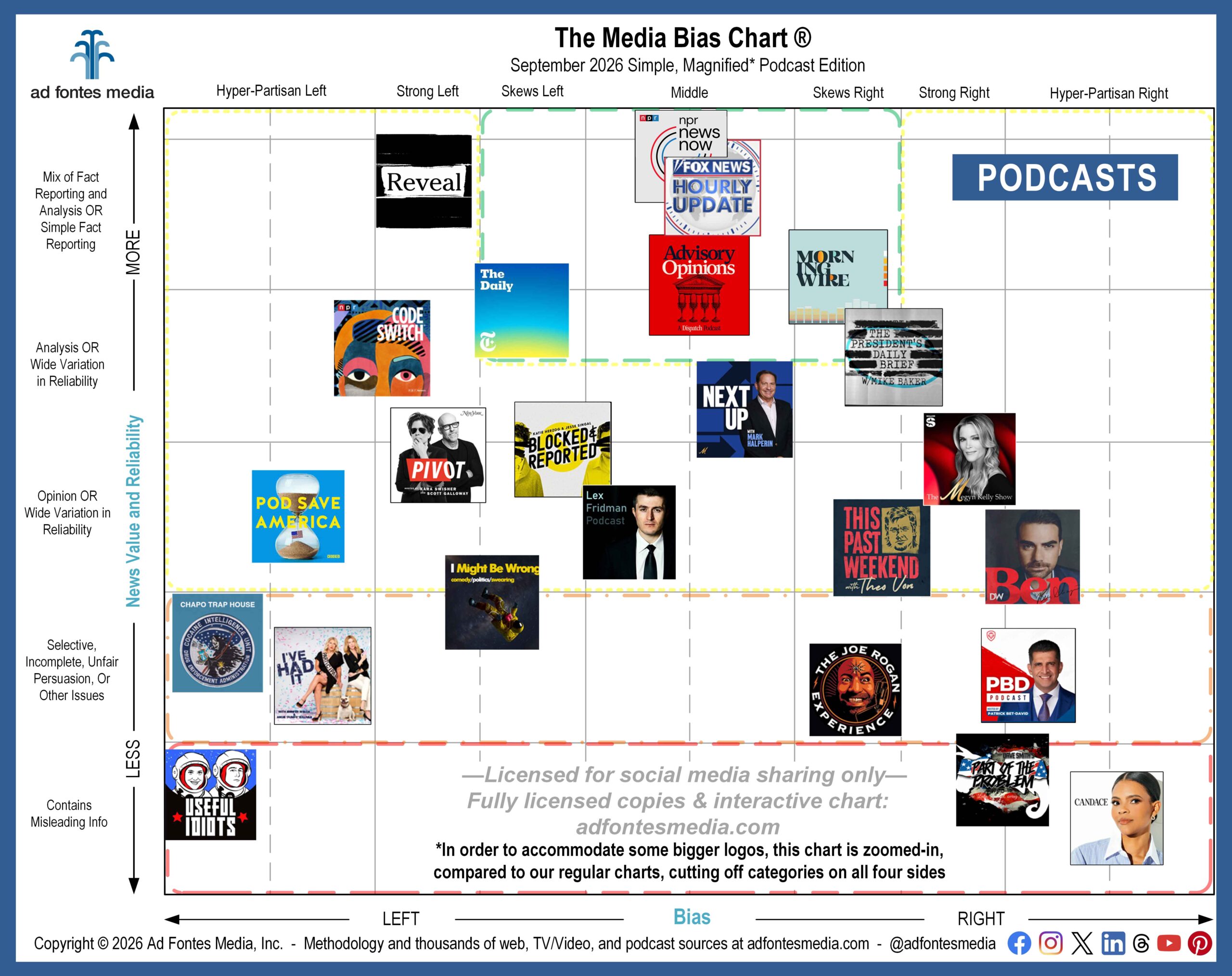
Today we’re releasing our simple Media Bias Chart® for podcasts, which features 24 shows from across the political spectrum.
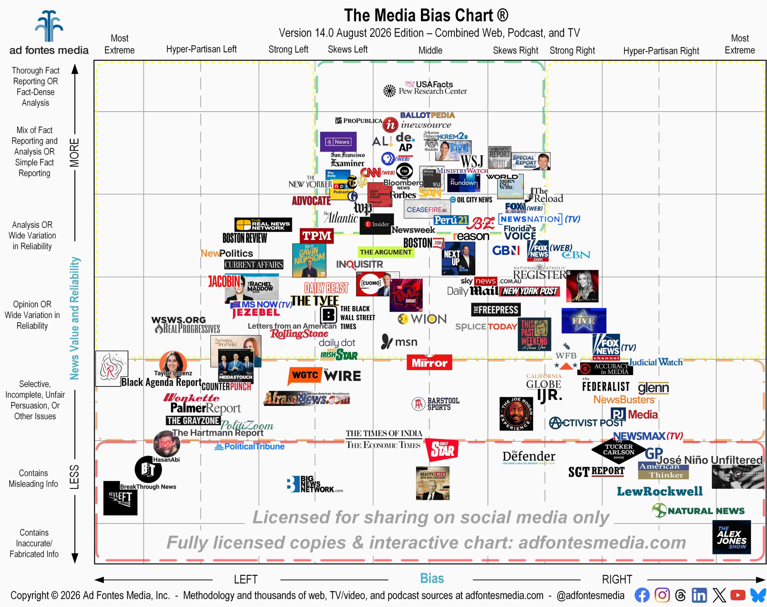
Why is this called a “simple” chart? Over the years we’ve heard complaints that the chart is too crowded and the source logos are too small, making the chart difficult to read. Our simple charts help to solve these issues by including fewer sources but making the logos larger.
The logos included on the chart represent sources that our team has rated as both high and low in reliability, as well as bias ratings ranging from balanced to hyper-partisan left and right. Several types of news podcasts are featured, including many that feature political news and opinion, such as Pod Save America and The Ben Shapiro Show, and ones that focus on particular subjects, such as Advisory Opinions with David French and Sarah Isgur, which talks about the law, and Pivot with Kara Swisher and Scott Galloway, which covers a lot of technology topics.
There are podcasts from recognizable media companies like NPR, the New York Times and Fox News, but there are also independent shows like PBD Podcast, Chapo Trap House and The Megyn Kelly Show.
We also included podcasts from Joe Rogan, This Past Weekend w/ Theo Von and Lex Fridman, which are primarily interview shows of both non-political and political guests. The reliability and bias ratings of these podcasts are made up of both what the guests say and how the host interacts with the guest. For more on Joe Rogan’s podcast rating specifically, check out our video about it.
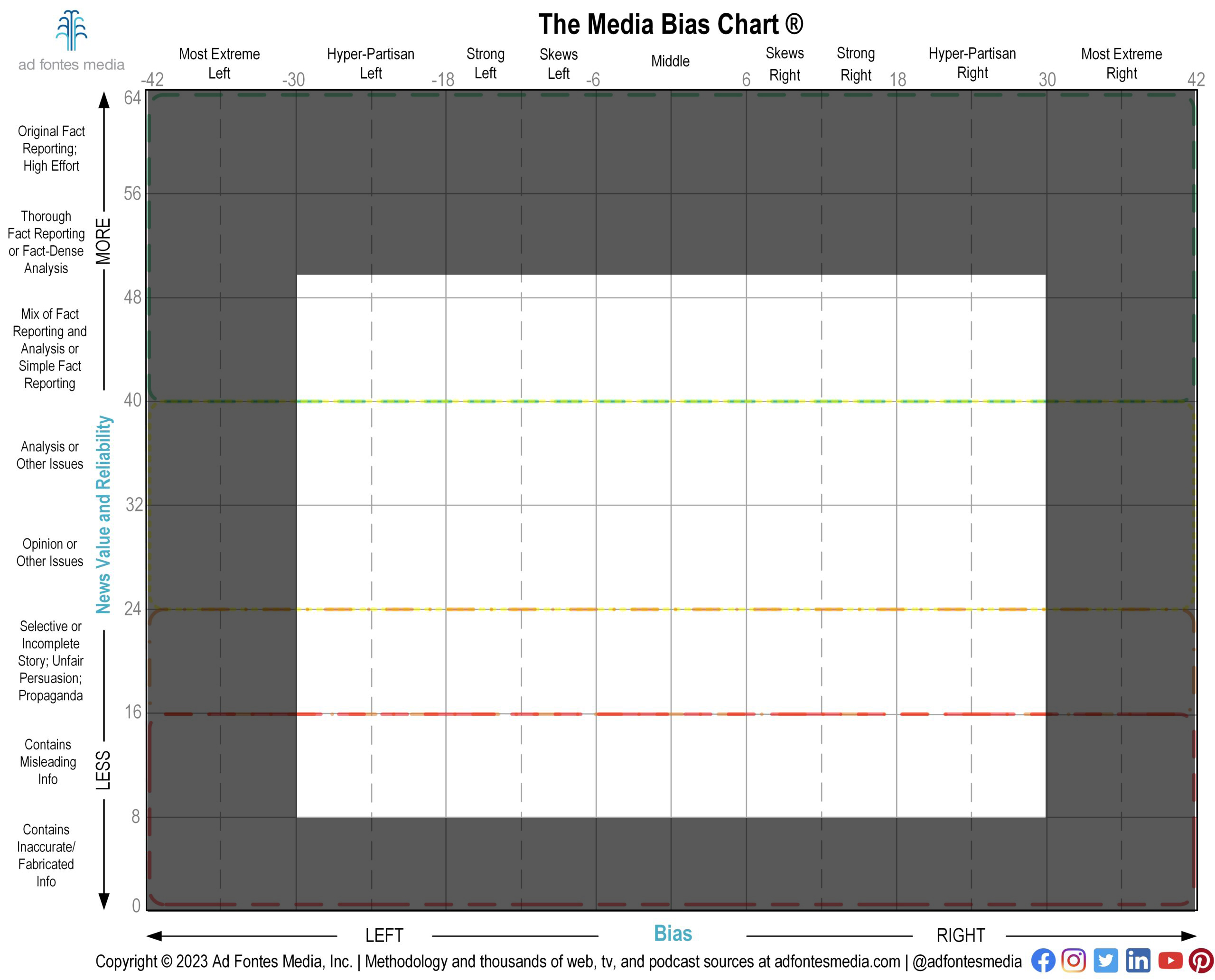
In order to make the logos as large and as readable as possible, we’ve magnified a portion of the chart and removed the sections around the edges. That means that we have omitted any sources that fall entirely within the “Most Extreme” right and left bias categories and the “Contains Inaccurate/Fabricated Info” reliability category.
In all, our team has fully rated 912 podcasts, and this simple Media Bias Chart® features only 24 of them (find a list of them here). You can download a free, licensed version of this simple, magnified Media Bias Chart® for podcasts here!
Here’s a list of the sources that fall within the green box on this chart. Our analyst team has found that these sources are generally reliable and minimally biased:
- Advisory Opinions – David French & Sarah Isgur
- Fox News Hourly Update
- Morning Wire
- NPR News Now
- NYT: The Daily
- The President’s Daily Brief with Mike Baker
We’ve fully rated more than 4,830 sources, and we have to select only a few dozen of them to put on each static chart in order to keep it readable. That’s why we created an Interactive Media Bias Chart® and a free app for Android and iPhone that allows you to search for sources by name. Both are free (with daily search limits), but for now, the free interactive chart allows you to search for only 250 of our top sources. But soon we’ll be debuting our newest version of the interactive chart, and it allows everyone to search for ANY source we’ve rated!
Don’t miss upcoming announcements about the release of our new-and-improved Interactive Media Bias Chart®! Sign up for our email list if you haven’t already!
 Beth Heldebrandt is Director of Communications at Ad Fontes Media. She has more than 30 years of experience in the fields of journalism and public relations, and was an adjunct instructor of journalism for 17 years at Eastern Illinois University. Beth has a B.A. in journalism from Southern Illinois University-Carbondale and an M.A. in English from Eastern Illinois University. She’s a mom and grandma, and enjoys traveling, puzzles and reading.