
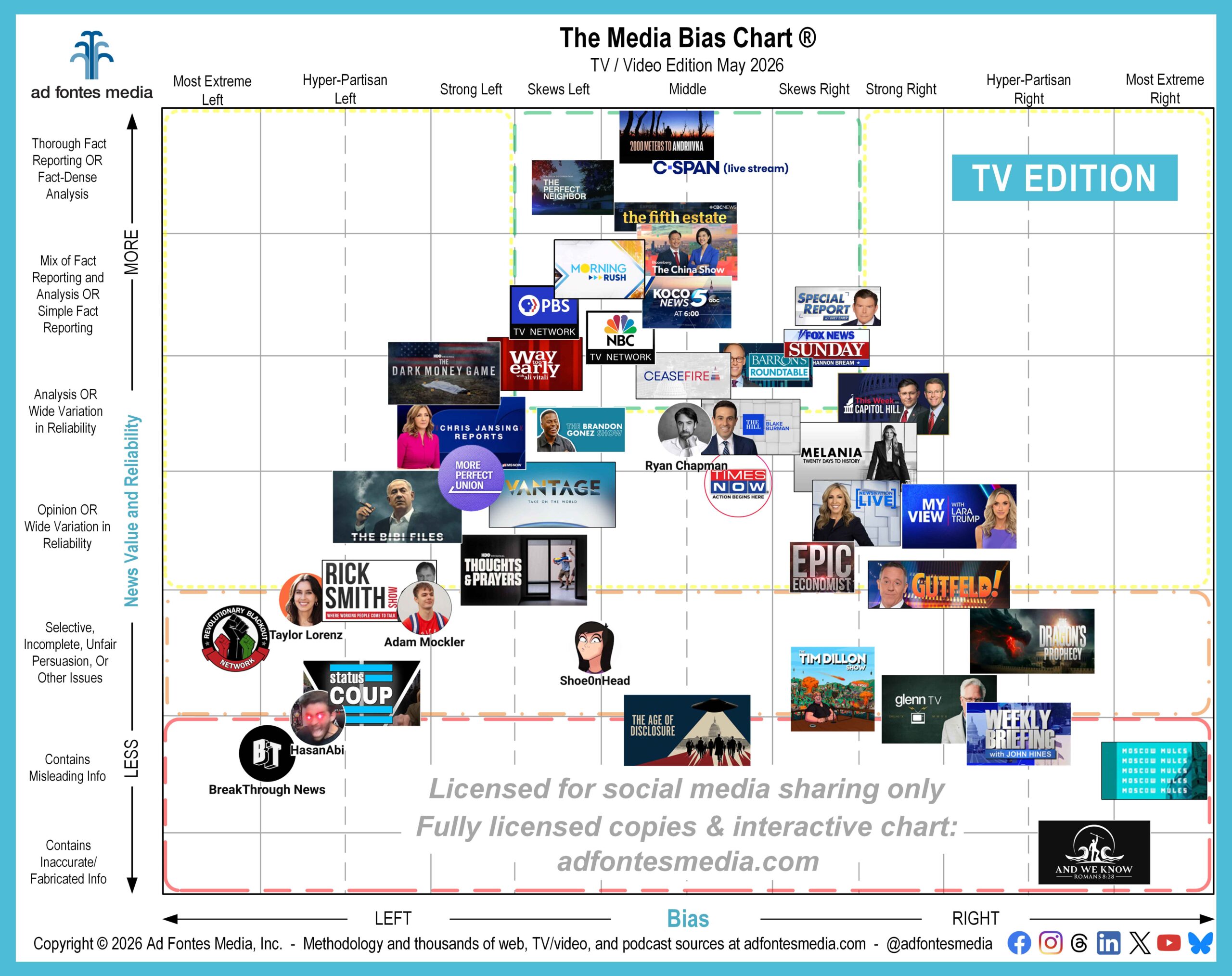
The May edition of the Media Bias Chart® for TV/Video sources includes 45 of the 890 news and news-like TV and video shows fully rated by our team. You’ll find 14 source logos inside the green box (top middle) of this chart. Let’s talk more about what that means.
Sources rated by our team as minimally biased and fact-based fall within the green box; that is, shows and videos with a reliability rating of 36 and above and a bias rating between -12 and 12.
Reliability: The reliability rating is found on the vertical (y) axis of the chart. The more fact-ful (full of facts) a piece of content is, the higher its reliability rating. The green box covers all three fact-dense categories on the chart (high-effort reporting, fact-dense analysis, simple fact reporting) and also the top half of the “analysis” category, because we’ve found that analysis based on solid facts is still reliable.
Bias: The bias rating is presented on the horizontal (x) axis of the chart. The most balanced and/or minimally biased content falls close to the left-right middle of the chart. The green box includes all content rated as “middle/balanced” but also includes content rated as “skews left” and “skews right.” We believe that bias is not inherently bad, and being exposed to reliable, but minimally biased content from the “other side” can help keep us all from getting stuck in a filter bubble.
A source falls inside the green box when a weighted average of all content rated from that source places it there. Here’s a list of the 14 sources that qualified for the green box on this edition of the TV/video chart. (More TV/video sources fall within the green box, and we’ll feature those on future charts.)
- 2000 Meters to Andriivka
- Bloomberg: The China Show
- C-SPAN Live Stream
- C-SPAN: Ceasefire
- CBC: The Fifth Estate
- Fox Business: Barron’s Roundtable
- Fox News Sunday with Shannon Bream
- Fox News: Special Report w/ Bret Baier
- KOCO 5 News Oklahoma City: KOCO 5 News at 6pm
- MS NOW: Way Too Early with Ali Vitali (MSNBC)
- NBC News TV Network
- Netflix: The Perfect Neighbor
- PBS TV Network
- Scripps News: Morning Rush
This list contains a mix of different kinds of TV/video content. For example, you’ll see two TV networks — NBC and PBS, which means that an average of all content we’ve rated from those networks qualified them for the green box.
It includes two Fox News shows and one MS NOW (MSNBC) show, which some will find surprising. But as we’ve pointed out many times before, not all content on a particular network is the same. Fox News and MS NOW have some green-box content, but they also broadcast shows that fall lower on the chart. For example, on this chart, the Fox News shows Gutfeld! And My View with Lara Trump (on the right) and MS NOW’s Chris Jansing Reports (on the left) all fall outside the green box.
You’ll also find two documentaries inside the green box of this chart: Netflix’s “The Perfect Neighbor” and “2000 Meters to Andriivka.” We rate documentaries because they are “news-like” content, but keep in mind that when we rate a documentary we’re analyzing one long piece of content, which is different than most other TV/video ratings. For example, every TV show on our chart is made up of ratings from multiple episodes.
We added the green box to the chart so that news consumers could easily find news sources that we’ve rated as minimally biased and fact-based. It’s important to keep your news diet healthy while also consuming news from a variety of sources and viewpoints.
Twelve TV/video sources are making their debut on the May Media Bias Chart®:
- Adam Mockler (YouTube)
- C-SPAN: Ceasefire
- Fox News: My View with Lara Trump
- KOCO 5 News Oklahoma City: KOCO 5 News at 6pm
- MS NOW: Way Too Early with Ali Vitali (MSNBC)
- NewsNation: NewsNation Live Weekend with Laura Ingle
- PBS TV Network
- RT: Moscow Mules
- Ryan Chapman (YouTube)
- The Bibi Files
- The Dragon’s Prophecy
- Vantage by Palki Sharma
We know it’s hard to see the logos of all 45 sources included on this chart; you can see a list of them here). Why these 45? We choose a selection of sources to feature each month because it’s impossible to put 800 TV/video sources in one image (the result would be a completely unreadable chart). In order to make the logos as large and readable as possible, we have magnified a portion of the chart and removed portions around the edges that contain no sources.
Don’t see your favorite show on the May chart? You can look up ratings on all sources we’ve analyzed and create custom chart images using our free mobile app available for Apple and Android. (Our analysts have fully rated more than 4,700 sources, with commercial data on about 14,360!) You also can access the free version of the interactive chart on the website, which allows access to data on 250 of our top sources. Daily search limits apply.
To get expanded access, you’ll need a News Newbie or News Nerd subscription. Our subscribers can search all sources our team has fully rated (websites, podcasts and TV/video), with other added benefits, including invitations to our new Navigating the News with Vanessa series featuring our founder and CEO, Vanessa Otero!
If you want to keep up on all of our work, join our email list! We’ll send you news about the latest chart releases, Topic of the Week analyses, and more!
 Beth Heldebrandt is Director of Communications at Ad Fontes Media. She has more than 30 years of experience in the fields of journalism and public relations, and was an adjunct instructor of journalism for 17 years at Eastern Illinois University. Beth has a B.A. in journalism from Southern Illinois University-Carbondale and an M.A. in English from Eastern Illinois University. She’s a mom and grandma, and enjoys traveling, puzzles and reading.
