

By Erin Fox-Ramirez and Jennifer Arvin Furlong
Ad Fontes Media exists to bring people together, to challenge divisiveness, and facilitate meaningful debate across differing perspectives. If we are to reduce polarization and repair relationships, we must recognize the important role that language plays in achieving these goals. The language we use is a direct reflection of our culture and our values and helps us to create meaning in the world around us. This is why we are intentional in the language we use to describe the information we rate, as well as in the language we use to describe our organization.
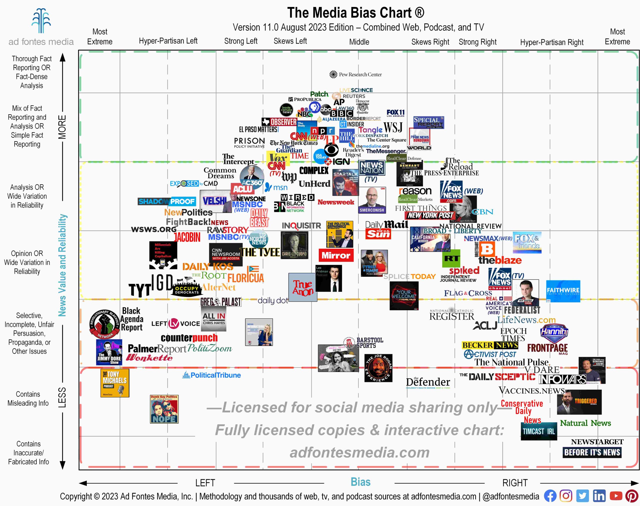
Although the Media Bias Chart® strikes many observers as an intuitive infographic, it’s really complex. The Media Bias Chart is a combination of a defined taxonomy (a system of classification) and a methodology (a repeatable process) for placing news and news-like sources within that taxonomy. We produce objective, reproducible, quantitative, comprehensive, large-scale data analyses, which is no easy task.
News stories are often complex and multifaceted, covering a wide range of topics, while using varying methods and processes to tell a story. Thus, the chart is a multi-dimensional concept that incorporates many cultural and political factors that inform our content analysis methodology. Our system of news content ratings produce data that we hope will encourage more discussions and a willingness to consider multiple points of view. This is why we don’t call ourselves a “watchdog” organization.
We are aware of the importance of language, and being labeled a “watchdog” suggests we interfere or meddle in journalistic practices, maybe even confrontationally. We are a news intelligence organization, providing insights about the news so you can make more informed decisions about which sources you choose to consume for yourselves. We do monitor the news media for reliability and bias, and present our findings in the form of the Media Bias Chart. Our aim is to uplift the news ecosystem so that society as a whole may benefit from higher reliability news sources.
What language should we consistently use? The language on the #MediaBiasChart.
According to findings from More in Common, Americans believe 55% of Democrats and Republicans hold extreme views, when in reality it is closer to 30%. However, “…more than three quarters of Americans believe our differences are not so great that we cannot come together,” More in Common concluded. How do we bridge this perception gap – between what we think of those with opposing political beliefs, and those we call friends and neighbors? It begins with clarity in communication. To avoid ambiguity and prevent assumptions, it’s critical to be intentional and specific in the words we use.
Our analysts start their journey with Ad Fontes Media by going through 35 hours of training and observational hours, followed by weekly training led by CEO and founder Vanessa Otero. Having our analysts begin with a shared lexicon allows them to discuss their ratings and have conversations that bridge perception gaps and reduces miscommunication. When discussions regarding where a source should be placed on the Media Bias Chart, our analysts are expected to use specific language from our methodology framework, which creates a shared understanding of information.
On the vertical scale of the Media Bias Chart, sources are labeled using the following categories, based on their reliability rating:
- Thorough Fact Reporting
- Fact-Dense Analysis
- Mix of Fact Reporting and Analysis
- Simple Fact Reporting
- Analysis, Opinion, Wide Variation in Reliability
- Selective, Incomplete, Unfair Persuasion, Propaganda, or Other Issues
- Contains Misleading Information, and
- Contains Inaccurate/Fabricated Information
On the horizontal axis, measuring bias, sources are labeled using the following categories:
- Most extreme left/right
- Hyper-partisan left/right
- Strong left/right
- Skews left/right
- Middle or balanced bias
These categories on the chart are just the tip of the iceberg when it comes to the specific language our analysts use to discuss ratings. Other important concepts, such as opponent characterization and political terminology, add another layer of complexity to a challenging task, but that’s an article for another day.
For now, suffice it to say, we are so much more than what the term “watchdog” indicates. We don’t monitor the news or meddle in journalistic practices. Rather, we promote critical thinking and work toward building bridges. And we educate. If you would like to join us on this journey and learn to have meaningful conversations about the news using language that avoids ambiguity, prevents assumptions, and reduces miscommunication, consider our subscriptions that are available for individuals and educators. To the advertisers, brands and publishers interested in our work, contact us so you can learn how to invest in high-quality and high reliable news sources with confidence.
If you want to stay informed on the great work we’re doing in the news media space, join our mailing list.
 Erin Fox-Ramirez is director of Ratings and Research for Ad Fontes Media, a PhD student in Psychology researching media and conspiracies. She has a MA in Media Psychology from Fielding Graduate University and a BS from Pennsylvania State University. Her previous work includes the DoD, the USPTO, and the RAND Corporation. A native to the Washington D.C. area, she is passionate about improving the news for all and believes strongly in the mission of Ad Fontes. She is a proud aunt, pet parent, and spends her spare time hiking, reading or kayaking in the low country.
 Jennifer Arvin Furlong, Director of Communication & Analyst Manager, is a business owner, author, podcaster, and TEDx speaker/coach. She has 30 years of experience in the communication industry, 18 of them teaching in higher education. Jen is the President of Media Literacy Now, a Marine Corps veteran, and a first-generation college graduate with a B.A. and M.A. in Communication.
